Accessible Form Design: How to Build Forms Everyone Can Use in 2026

Table of Contents
TL;DR — Quick Hits
- 51% of the web's top home pages ship form inputs with no proper label, making them unusable with a screen reader (WebAIM Million, 2026).
- A placeholder is not a label — it disappears when users type and screen readers often skip it. Always use a real
<label>. - Accessible form design is a conversion fix and a legal one: 3,117 federal ADA website lawsuits were filed in 2025, up 27% year over year.
- Build forms with semantic HTML, not ARIA patches — WebAIM found pages loaded with ARIA average more errors, not fewer.
- Static, hand-coded sites lead the accessibility data: Astro-built pages average 84% fewer errors than the typical home page.
Most small business websites have one page that matters more than any other: the page with the form. The contact form, the quote request, the booking widget — that is where a visitor becomes a lead. So it should worry every owner that, according to the WebAIM Million 2026 report, 51% of the web's top home pages ship form inputs with no proper label, and a full third (33.1%) of all form fields are not correctly labeled. A form a screen reader user cannot complete is a lead you never receive — and, more and more often, a lawsuit waiting to happen.
Accessible form design is the practice of building forms that everyone can complete: people using a mouse, a keyboard, a touch screen, a screen reader, or text-enlargement software. It is not a niche concern or a "nice to have." A missing label is one of the first things a website accessibility audit flags, and it is also the single most common reason a real customer abandons your form before hitting submit.
Why accessible form design quietly costs you leads
An inaccessible form fails twice: it loses revenue and it creates legal exposure. The average home page now carries 6.9 form inputs — a 36% increase in just three years — yet 95.9% of pages still have detectable WCAG failures, a figure that actually got worse in 2026 after years of slow improvement. Every unlabeled field on a contact form is a visitor with a disability who simply cannot finish, and every form is a lead generation opportunity you are throwing away.

The legal side is no longer hypothetical. UsableNet's tracking shows 3,117 federal website accessibility lawsuits were filed in 2025, a 27% jump over the prior year, with e-commerce and service businesses the most frequent targets. Forms are a favorite plaintiff exhibit precisely because the failure is so easy to demonstrate: turn on a screen reader, tab to the field, and hear nothing useful. If you want the full picture on exposure, we covered it in our guide to ADA website lawsuit risk.
What makes a form accessible?
A form is accessible when every control has a programmatic label, the whole thing works with a keyboard, errors are announced clearly, and nothing depends on color alone. Those four pillars come straight from how assistive technology reads a page, and they are the backbone of any form that works for everyone.
The label is the foundation. As Google's web.dev forms accessibility guide puts it, every form control must have an associated <label> element — the label is read aloud by screen readers, and clicking it also focuses the field, making a bigger tap target for everyone. The most reliable method is the classic pairing: a <label for="email"> matched to an <input id="email">, the pattern documented by MDN.
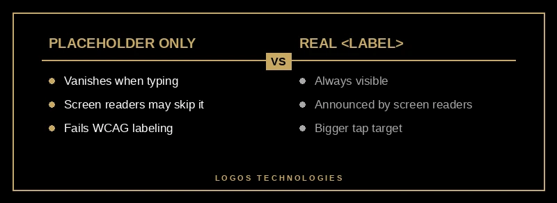
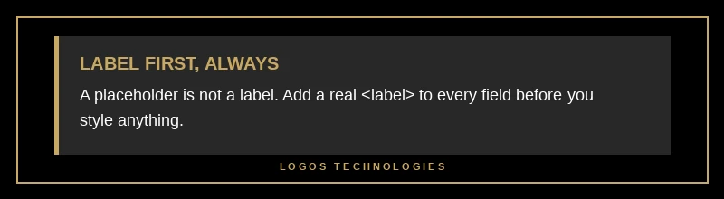
The most common mistake is leaning on placeholder text instead of a label. Placeholder text vanishes the moment a user starts typing, screen readers treat it inconsistently, and it fails WCAG's labeling requirement. A placeholder can supplement a label, but it can never replace one.
How to make a form accessible in 6 steps
Building an accessible form is a short, repeatable procedure. Follow these six steps on every form you ship.
1. Add a real label to every field
Give each input its own visible <label> element, connected with matching for and id attributes. Add the label first, before you style anything, so you never forget it.
2. Use semantic HTML controls
Build with native <input>, <select>, and <textarea> elements rather than styled <div>s. As web.dev demonstrates, a <div> dressed up to look like an input is invisible to screen readers and won't even submit its data — the native element gives you keyboard support, focus, and form submission for free.
3. Make the form keyboard-navigable
Every field must be reachable with the Tab key in a logical order, and the currently focused control must show a clearly visible focus indicator. If you remove the default outline for design reasons, replace it with something equally obvious using :focus-visible.
4. Write helpful error messages
When validation fails, tell the user what went wrong and how to fix it — "Enter a valid email like name@example.com," not just "Invalid." Connect the message to its field with aria-describedby so screen readers announce it.
5. Never signal errors with color alone
A red border means nothing to a color-blind user. Pair every color cue with text or an icon. This is one of the most-failed checks in any WCAG 2.2 compliance review, and it is trivial to get right.
6. Test with a keyboard and a screen reader
Before you ship, complete your own form using only the keyboard, then again with a screen reader such as NVDA or VoiceOver. Five minutes of real testing catches problems no design mockup will.
Why hand-coded, static sites build more accessible forms
The 2026 data points to an uncomfortable cause for the regression: bloat. WebAIM directly attributes the rise in errors to heavier pages, framework overload, and "AI-assisted coding" that ships markup nobody audits. Tellingly, the same report found that pages loaded with ARIA attributes averaged 59.1 errors versus 42 on pages without it, while Astro-built pages averaged just 9 — 84% below the typical home page and the best of any framework measured. Developers are reaching for ARIA patches instead of writing the semantic HTML that would have worked the first time.
That gap is the case for hand-coded custom web design in a nutshell: when a human writes clean, semantic markup instead of bolting plugins onto a page builder, accessible forms are the default, not a retrofit. It is also why accessibility overlays do not fix forms — a script injected after the fact cannot label a field that was never built correctly. The durable fix lives in the HTML, which is exactly what a thorough website accessibility audit is designed to surface.
Frequently Asked Questions
Do placeholders count as labels?
No. Placeholder text is not a substitute for a label. It disappears as soon as the user types, screen readers handle it inconsistently, and relying on it fails WCAG's labeling requirement. Use a real <label> and treat the placeholder as an optional hint at most.
Can an accessibility overlay make my forms compliant?
Not reliably. Overlays are third-party scripts that try to patch accessibility at runtime, but they cannot rebuild a form that lacks proper labels or keyboard support, and they have featured in a growing number of lawsuits. The dependable approach is to fix the underlying markup, as we explain in our breakdown of why accessibility overlays fail.
Does accessible form design help SEO?
Yes, indirectly but meaningfully. Search crawlers and AI answer engines parse the same semantic HTML that screen readers rely on, so labeled fields, clear headings, and clean markup make your pages easier for both to understand. Accessible forms also reduce abandonment, and the engagement signals that follow support your broader conversion optimization efforts.
What WCAG level should a small business form meet?
Aim for WCAG 2.2 Level AA, the standard most U.S. and international accessibility expectations now reference. For forms, that means labeled controls, keyboard operability, visible focus, error identification, and not using color as the only signal — the same fundamentals covered in broader form design best practices.
Build forms that work for every visitor
Accessible form design is not a compliance chore bolted on at the end — it is how you stop leaking leads and avoid an entirely preventable lawsuit. The fixes are mostly free: a real label, semantic HTML, a visible focus state, and an honest five minutes with a keyboard and a screen reader. At LOGOS Technologies, we hand-code fast, static websites in Papillion, Nebraska where accessibility is built into the markup from the first line, not patched on afterward. If your forms are costing you customers, take a look at our web design services or contact us for a straight answer on where your site stands.