
Website Color Contrast: The #1 Accessibility Failure and How to Fix It in 2026

Table of Contents
TL;DR — Quick Hits
- Low-contrast text is the single most common accessibility failure on the web, found on 79.1% of the top one million home pages.
- WCAG 2.2 Level AA requires a 4.5:1 contrast ratio for normal text and 3:1 for large text and UI components.
- Only about 5.2% of the top one million home pages pass automated accessibility checks with zero errors.
- 3,117 federal website-accessibility lawsuits were filed in 2025 — a 27% jump over 2024 — and contrast is one of the cheapest violations to fix.
- Test with a free Lighthouse audit, fix the colors in your CSS, and bake an accessible palette into your design tokens so it never regresses.
Of all the ways a website can fail people with disabilities, one shows up more than any other, and it's almost embarrassingly fixable: text that doesn't have enough contrast against its background. According to the WebAIM Million 2025 report, low-contrast text was detected on 79.1% of the top one million home pages, making it the most common accessibility issue on the web by a wide margin. The same study found that 94.8% of those home pages had detectable WCAG failures of some kind — meaning only about 5.2% passed automated checks cleanly.
Color contrast accessibility isn't a niche concern for a handful of users, either. Low-contrast text is hard or impossible to read for people with low vision, color vision deficiencies, and anyone using a phone in bright sunlight. The good news is that contrast is the rare accessibility problem you can usually fix by changing a few values in your CSS. If you want the full picture of where your site stands, start with a complete website accessibility audit — but contrast is almost always the highest-impact place to begin.
What is the WCAG color contrast requirement?
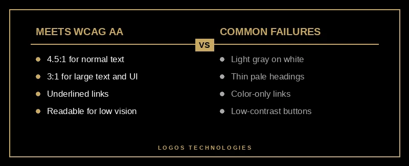
WCAG 2.2 Level AA requires a contrast ratio of at least 4.5:1 for normal text and 3:1 for large text and user-interface components. Large text means 18pt and up, or 14pt and up if bold. The stricter Level AAA standard raises those to 7:1 and 4.5:1.
That ratio compares the relative luminance of your text color against its background. Pure black on pure white is 21:1; the light-gray-on-white that designers love is often somewhere between 2:1 and 3:1, which fails. The specification defines the exact thresholds under Success Criterion 1.4.3 (Contrast Minimum), and Google's web.dev guide to color and contrast explains why 4.5:1 was chosen — it compensates for the contrast-sensitivity loss of roughly 20/40 vision. For most small business sites, hitting 4.5:1 on body text and 3:1 on headings and buttons covers the overwhelming majority of the risk.

There's a second rule that trips people up: you can't use color alone to convey meaning. A link that's only distinguished from body text by being blue, or a "required field in red" with no other indicator, fails for users who can't perceive that color difference. Links need an underline or some non-color cue, and status colors need an icon or label alongside them. This is part of the broader set of standards we break down in our WCAG 2.2 compliance checklist.
Why does low contrast happen so often?
Low contrast is everywhere because it usually looks fine to the designer who built it. Trendy light-gray text, thin font weights, and pale brand colors read clearly on a high-end calibrated monitor in a dim office — and fail completely for a user with low vision on a cheap phone screen outdoors.
The WebAIM data shows the scale of it: the average home page in 2025 carried 29.6 distinct instances of low-contrast text. That number actually improved 14.4% from 34.5 in 2024, so awareness is rising, but it's still nearly thirty separate violations on a typical page. Most of them come from the same handful of sources: muted placeholder text, secondary "helper" copy in light gray, ghost buttons with low-contrast borders, and overlay text sitting on top of a busy photo.
Template and page-builder sites make this worse. When your colors come from a theme's defaults and get overridden by a dozen plugins, contrast drifts silently — a theme update changes a gray, a plugin injects its own button style, and nobody notices until a user complains or a demand letter arrives. A hand-coded site with a deliberate design system doesn't have that problem, because the accessible palette is defined once and reused everywhere. It's the same reason we argue contrast should be designed in from the start, not bolted on, the way good accessible website design treats it as a first-class requirement.
What are the legal stakes of failing contrast?
Failing color contrast is one of the most cited issues in ADA website-accessibility lawsuits, and the volume of those lawsuits is climbing fast. Because contrast failures are easy for automated tools and plaintiffs to detect, they frequently appear in demand letters and complaints.
According to UsableNet's analysis of 2025 filings, plaintiffs filed 3,117 website-accessibility lawsuits in U.S. federal court in 2025 — a 27% jump over 2024 — with e-commerce sites accounting for nearly 70% of cases. The uncomfortable part for business owners is that contrast is among the cheapest violations to remediate, so leaving it unfixed is leaving easy legal risk on the table. Overlay widgets that promise instant compliance don't solve it either; we explain why in our piece on why accessibility overlays fail. And if you're wondering whether any of this applies to your business, our guide to what an ADA compliant website actually requires lays out the baseline.
How do you fix color contrast issues on your website?
You fix contrast by testing your pages, correcting the failing colors in your CSS, and locking an accessible palette into your design system so it stays fixed. Pair this with a full website accessibility audit so contrast fixes don't hide other issues. Here's the process in order.
1. Test your current contrast
Run a free Lighthouse accessibility audit in Chrome DevTools, or use a contrast-checker tool, against your live pages. It will flag every text and UI element that falls below the WCAG thresholds, so you're working from facts instead of guesses.
2. Fix body text to at least 4.5:1
Most failures are body copy. Darkening light-gray text — say, from a #999 gray to a #595959 or darker — usually clears the 4.5:1 bar against a white background without changing your look much.
3. Fix large text and UI components to at least 3:1
Headings 18pt and up, plus buttons, form borders, icons, and focus indicators, must hit 3:1. Pale "ghost" buttons and faint input outlines are the usual culprits here.
4. Stop relying on color alone
Add underlines to in-text links, pair status colors with an icon or text label, and make sure keyboard focus styles are visible. Meaning should never depend on a user perceiving a specific color.

5. Bake contrast into your design tokens
Define your accessible colors once as CSS variables or design tokens, then build every component from them. New pages inherit compliant contrast automatically, which is how you keep contrast from regressing six months from now.
Frequently Asked Questions
What contrast ratio do I need for accessibility?
For WCAG 2.2 Level AA, you need at least 4.5:1 for normal text and 3:1 for large text (18pt and up, or 14pt bold and up) and UI components. Level AAA requires 7:1 and 4.5:1. Most small businesses target AA, which covers the large majority of legal and usability risk.
How do I check my website's color contrast?
Use a Lighthouse accessibility audit in Chrome DevTools or a free online contrast checker. Enter your text and background colors, or scan the live page, and the tool returns the exact ratio and whether it passes AA and AAA. It takes minutes and requires no special software.
Is light gray text an accessibility problem?
Usually, yes. Light-gray text on a white background is the single most common contrast failure on the web. It often measures around 2:1 to 3:1, well below the 4.5:1 minimum for normal text, which makes it hard to read for users with low vision.
Does fixing color contrast help SEO?
Indirectly, yes. Better contrast improves readability and usability, which supports engagement signals, and accessible, well-structured pages tend to align with the page-experience factors Google rewards. It won't rank you on its own, but it removes a barrier that hurts both users and search performance.
Ready to fix what's costing you readers and risk?
Color contrast is the most common accessibility failure and one of the easiest to fix — but only if your site is built so the fix actually sticks. At LOGOS Technologies, based in Papillion, Nebraska, we hand-code fast, accessible websites with compliant color systems built in from day one, not patched on with an overlay. Explore our web design services to see how we approach accessibility, or contact us and we'll run a contrast check on your current site and show you exactly what's failing.