

Form Design Best Practices for 2026: How to Stop Losing Leads at the Last Step

Table of Contents
TL;DR — Quick Hits
- Every additional form field drops conversion by an average of 4.1% — three-field forms convert at 23.1%, ten-field forms at 6.9%.
- 55% of users who start a form never submit it; "form too long" is the #1 self-reported reason at 37%.
- Single-column layouts outperform multi-column on completion, errors, and time-to-complete in every published study.
- Multi-step forms lift conversion 14% on average and 21% on lead-gen forms specifically — even with the same total field count.
- 45% of mobile users abandon when forms are hard to fill — and form JavaScript drags INP, the Core Web Vital Google reweighted in March 2024.
The form is where most small business websites quietly bleed money. Traffic shows up, the homepage does its job, the visitor reads the page, lands on the contact form — and 55% of them never hit submit, according to Formstack's 2025 study of 1,500 B2B decision makers. The rest of the funnel can be perfect and you'll still lose more than half your leads at the last six inches.
That's the part nobody wants to redesign because the form "works." It loads, it accepts input, it sends an email. So it sits there for years, written by whoever set up the CMS in 2019, and it costs the business a six-figure number every year without anyone noticing. Form design is one of the highest-ROI levers in professional website design, and almost nobody on the small business side actually pulls it. This post is the form design best practices that actually move the needle in 2026 — the field count, layout, and trust rules, sourced from real data, not opinions.
What does the data say about form length and conversion?
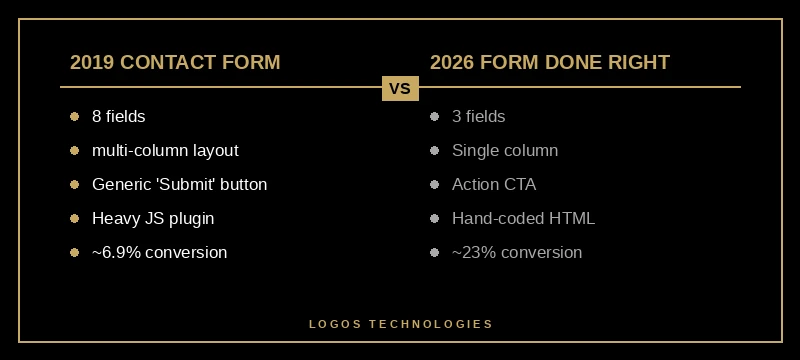
Short forms convert dramatically better than long ones, and the drop-off is steeper than most people guess. Three-field forms convert at 23.1%. Five-field forms drop to 17.0%. By seven fields you're at 11.4%, and at ten or more fields conversion collapses to 6.9%. HubSpot's analysis of over 40,000 customer landing pages found each additional form field decreases conversion by an average of 4.1%.
The rule of thumb: every field you can't justify in a one-sentence business reason should be deleted. "Phone, address, company size, job title, how did you hear about us, budget, timeline" is not a contact form — it's a CRM intake the visitor has to fill out for free. Most small business contact forms need three fields: name, email, and a single open text box for what the visitor wants. If you genuinely need to qualify leads, add one qualifier — not five.
Not all fields cost the same. Required phone fields cause a 5–15% drop. Password fields drop conversion 10.5% on the spot. Dropdowns with more than five options measurably underperform radio buttons. If you have to keep a high-friction field, make it optional and explain why you need it inline.
Why does single-column layout almost always win?
Single-column forms outperform multi-column forms on every measure that matters. Nielsen Norman Group's web form usability research documents that one-column layouts produce significantly better user understanding, fewer user errors, and higher overall conversion. Eye-tracking shows users scan multi-column forms in an unpredictable zig-zag; they scan single-column forms top-to-bottom, the way they read everything else online.
The exception people cite — that "first name / last name" should sit side-by-side — doesn't show a conversion benefit in any controlled test. It just feels denser. Density is not a design goal; completion is. Single column, label above the field, one field per row. That's the default unless you have a tested reason to deviate.
While you're at it: avoid placeholder text as a label substitute. Placeholder text disappears the moment the user starts typing, which means they can't verify what they entered without deleting it. It's also lower-contrast than real labels and fails accessibility checks in most palettes. Use a real <label> element with for matching the input's id — that's the same pattern that ships an accessible form per WCAG Success Criterion 3.3.2 and gets screen readers announcing the field correctly.

How do multi-step forms convert better with the same fields?
Splitting the same field count across two or three steps lifts completion by an average of 14%, and by 21% specifically on lead-generation forms. That's the rare CRO move that's basically free — same data captured, same backend, higher conversion.
The mechanics: a multi-step form puts the easiest, lowest-friction questions on step one (usually name + a single qualifier), and the harder questions (phone, budget, address) behind a progress bar that signals the user is already committed. Behavioral economics calls this the sunk cost effect — once a user has answered three questions, they're disproportionately likely to finish the fourth. CrazyEgg's CRO data shows that progress bars on long-form flows lift completion meaningfully for exactly this reason.
The catch: multi-step only works if step one is genuinely lower-friction than the whole form would be. If you split a three-field form into three single-field steps, you've just made a fast form slow. The rule: multi-step makes sense above ~5 fields total, and step one should never include phone, address, or any field that asks for money.
This is where small business sites usually beat the SaaS giants. The big platforms (HubSpot, Salesforce, Marketo) ship multi-step forms by default and treat them as the norm — but most contractor, dental, law, and HVAC sites still use a single 8-field form because that's what the template shipped with. Switching the same form to two steps with a progress indicator typically lifts submissions on launch day, before you change a single word of copy.
What do mobile users actually need from your form?
The mobile experience is where most form designs break, and where the biggest wins hide. Mobile abandonment runs around 80% versus 66% on desktop, and the top mobile-specific reason is "forms too difficult to fill out" — 45% of mobile users cite this as a reason they bailed.
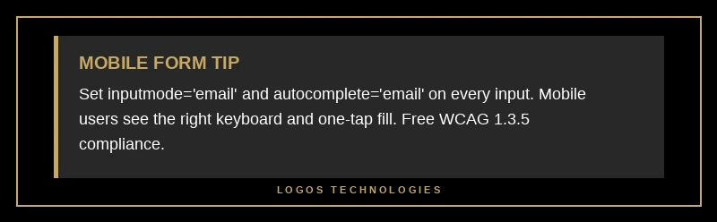
The fixes are mechanical and almost free. Set the inputmode attribute on every field — inputmode="numeric" on phone, inputmode="email" on email — so iOS and Android pop the correct keyboard. Set autocomplete to a valid HTML spec token on every field that asks for the user's own info: autocomplete="name", autocomplete="email", autocomplete="tel". That alone shaves seconds off mobile submission time and unlocks WCAG 1.3.5 compliance for free. Tap targets need to be at least 44×44 px per Apple's guideline; smaller touch targets are the silent reason for mistyped fields and rage taps.
The other mobile killer: form JavaScript that blocks the main thread. Heavy form libraries (especially anything bundled with a page builder) frequently push Interaction to Next Paint past 200ms on every keystroke, which is now a measurable Core Web Vital ranking signal. Google's own INP optimization guide calls out form input handlers as a top INP offender — debouncing handlers and breaking long tasks are the two recommended fixes. If your form lags when typing on a mid-range Android phone, you have an INP problem, not a UX problem.
This is where static-site architecture quietly wins. A hand-coded HTML form posting to a backend like Netlify Forms, Formspree, or a Cloudflare Pages function has near-zero client-side JavaScript and effectively zero INP cost. The WordPress contact form plugin shipping its own jQuery dependency, validation library, and analytics hooks does the opposite — every keypress fires three event listeners. The form converts worse and ranks worse, on the same content. We covered the underlying reason in our Core Web Vitals 2026 guide.
What makes a form feel trustworthy enough to submit?
After length, trust is the second-largest predictor of submission — and it's the part of form design best practices that small business sites most often miss. Self-reported abandonment data shows trust concerns about how data will be used account for around 19% of bailouts. Three patterns close that gap reliably.
First, microcopy near the submit button that names what happens after submission. "We'll reply by end of business day" or "We never share your email" outperforms a bare "Submit" button in basically every A/B test on record. The user wants to know what they're trading their email for; the form should answer the question before they ask it.
Second, visible trust signals near the form, not just on the rest of the page. A small SSL/privacy line under the submit button. A 1-sentence privacy note. The most recent client review or rating beside the form, if you have one. These don't take up real estate and they statistically meaningfully lift completion on lead-gen forms.
Third, button copy that names the action. "Submit" is the lowest-performing CTA in published CRO tests. "Get my free quote," "Send my question," "Reserve my spot" all outperform it because they restate the offer at the moment of decision. Semrush's CRO research finds that action-specific CTAs aligned with the form's value proposition consistently outperform generic "Submit" wording.
How do you handle spam without killing conversion?
Spam protection used to mean reCAPTCHA — and reCAPTCHA used to cost you ~3-5% of legitimate completions for the friction of "click all the traffic lights." Two patterns now dominate that don't tax the legitimate user.
The honeypot pattern is invisible to humans and catches a large share of bots for free: add a hidden field (off-screen via CSS, not display: none — bots read the DOM and skip display: none) that real users will never fill in. If it's filled, the submission is a bot. Zero friction. Zero JavaScript. Works on any static site backend.
For higher-traffic sites or higher-value forms, Cloudflare Turnstile (free) and Google reCAPTCHA v3 (invisible scoring) both run silently and only challenge users with low scores. The conversion cost is near zero for legitimate traffic. The honeypot pattern alone usually handles 80–90% of bot volume on a small business site, and Turnstile mops up the rest if you start getting hit. The old "select all the bicycles" interstitial should be retired in 2026.
Frequently Asked Questions
How many fields should a small business contact form have?
For most small business sites, three fields is the right answer: name, email, and a single open-text box for the visitor's question. Conversion data shows three-field forms convert at roughly 23%, while seven-field forms drop to 11% and ten-plus collapse to 6.9%. Add a qualifier field only if you genuinely need it to route the lead.
Is a single-column or multi-column form better?
Single-column. Nielsen Norman Group's research shows single-column layouts produce fewer errors, faster completion, and higher conversion than multi-column. The "first name + last name side-by-side" exception people cite doesn't show a conversion benefit in controlled tests — it just looks denser. Default to one field per row, label above the input.
Do multi-step forms really convert better?
Yes — by an average of 14%, and by 21% on lead-generation forms specifically, when the same total fields are split across 2–3 steps. The mechanism is partly the sunk-cost effect (a user three steps in keeps going) and partly the lower perceived effort of seeing 3 questions at a time instead of 10. The pattern only works above ~5 fields total; below that, multi-step adds friction without a payoff.
Does form design affect SEO?
Indirectly but meaningfully. Forms drive Interaction to Next Paint, which became a Core Web Vital in March 2024 and is now a ranking signal. Heavy form JavaScript on a slow mobile device can push INP past 200ms on every keystroke, which Google reads as a "needs improvement" score. Forms also affect dwell time and bounce — a form that frustrates users sends the page-experience signal the wrong direction.
What's the simplest form for a contractor or service business?
Three fields, one column, mobile-friendly inputs (inputmode and autocomplete set), a button that says what happens next ("Get my free quote"), and a one-line privacy note under it. That's it. The contractor, dental, plumber, and HVAC sites that consistently beat their template-based competitors run forms that look like this. Everything fancier is optional; nothing fancier is required.
The form is the conversion
For most small business sites, the form is the conversion. Everything before it is a slow build to that one moment, and a form that costs you 4.1% per extra field, doesn't ship autocomplete, blocks the main thread on mobile, and ends in a "Submit" button is leaving real money on the table every week. The 2026 version of professional website design treats the form as a first-class design artifact — not an afterthought stapled to the contact page. The form design best practices above are the cheapest, highest-leverage CRO move available to a small business site.
If your contact form is older than your phone and you don't know what its conversion rate is, that's the first thing to fix. LOGOS Technologies is a Papillion, Nebraska web design studio that builds fast, static, hand-coded sites — including form flows wired into Netlify Forms or Formspree so there's zero plugin overhead and no INP penalty. Take a look at our web design services or contact us and we'll review your current form against the field-count, layout, and INP rules in this post.