

Above the Fold Web Design in 2026: What Actually Belongs at the Top

Table of Contents
TL;DR — Quick Hits
- Users still spend 57% of viewing time above the fold, according to Nielsen Norman's most recent eyetracking research — down from 80% in 2010 but still the most valuable real estate on the page.
- Visitors form a visual opinion of your site in roughly 50 milliseconds (Lindgaard et al., 2006), so the hero has to land before any prose is even read.
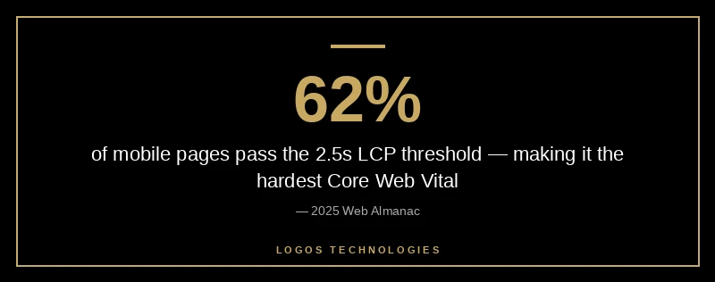
- The hero image is almost always your Largest Contentful Paint (LCP) element — only 62% of mobile pages currently pass the 2.5-second LCP threshold per the 2025 Web Almanac.
- Above-the-fold primary CTAs typically lift conversion rates by 20–30% over below-the-fold-only placements.
- The "fold" is no longer a single line — design for a viewport range (375px to 1440px+ tall), not a single screen.
The "fold" is one of the most argued-about ideas in web design, and most of the arguments are out of date. Modern Nielsen Norman Group eyetracking research shows users still spend roughly 57% of their page-viewing time above the fold — down from 80% a decade ago, but still a lopsided share of attention concentrated in the first viewport. Within that area, more than 65% of viewing time clusters in the top half. So no, the fold is not dead. It just moved.
What changed is that the fold is no longer a single horizontal line measured against a 768px monitor. It's a band — somewhere between a 375×667 iPhone SE viewport and a 1440×900 laptop — and good professional website design treats it as a band, not a guillotine. The question stops being "does this fit above the fold?" and becomes "what's the first thing a real visitor sees, and does it earn the next scroll?"
What Is Above the Fold in 2026?
Above the fold is the part of a webpage visible without scrolling on the device the visitor is using. The phrase comes from newspapers — the top half of a folded broadsheet was the only part visible on the newsstand — and it carried over to the web because the same logic applies: people decide whether to engage with what they can see. In 2026, the term refers to a responsive band rather than a fixed pixel boundary, because every visitor's "fold" is determined by their viewport.
The technical definition is unchanged. The design implication is bigger. Because viewport heights now range from ~600px (small phones in landscape) to ~1100px (large desktops), the section a user sees first might be the entire hero, or it might be just the headline. The job of above-the-fold design is to make sure whichever portion lands first does the work that needs doing.
What Actually Belongs Above the Fold
Most underperforming small business websites cram too much above the fold or too little. The high-converting pattern is narrow:
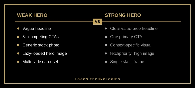
- A clear value-proposition headline — what you do and who you do it for, in plain language. Not a tagline, not a brand promise. If a visitor read only the headline, they should know whether to keep reading.
- A subhead or supporting line — one sentence that answers the obvious follow-up. ("Hand-coded static sites built to load in under one second.")
- One primary call-to-action — the single action you most want a first-time visitor to take. Two CTAs is a dilution; three is a confession that you don't know what you want them to do.
- A relevant hero visual — usually an image, illustration, or short looping video. Generic stock imagery actively hurts you here; context-specific imagery (your actual product, your actual location, your actual people) outperforms.
- One credibility cue — a logo strip, a star rating, a one-line testimonial, or a number ("Serving 200+ clients since 2019"). Not the whole social-proof case; just one signal.
That's it. Five elements, not fifteen. Anything else — feature lists, pricing tiers, FAQ snippets — earns its place by clearing the threshold of "the visitor cannot make a decision without this." Almost nothing meets that bar at the top of the page.

The thinking-trap that bites most small business owners: trying to communicate everything because the visitor might leave. The data goes the other direction. Visitors leave faster when the hero is busy, because they can't tell what to look at. Cleaner heroes hold attention longer, which in turn earns the second screenful — and according to Nielsen Norman, 81% of viewing time happens in the first three screenfuls. Win the first one and you keep the next two.
Why Above-the-Fold Design Affects Both Conversions and SEO
In 2026, above-the-fold design is no longer a pure UX concern — it's a Core Web Vitals concern, which means it's a ranking concern. The hero image is, in nearly every layout, the Largest Contentful Paint (LCP) element. LCP is the metric Google uses to score how quickly the meaningful content of a page becomes visible, and per the 2025 Web Almanac, only 62% of mobile pages clear the 2.5-second "good" threshold — making LCP the hardest Core Web Vital to pass.
That has direct implications for how you build the hero:
- Don't lazy-load the hero image. Lazy loading tells the browser to delay the request — useful for below-the-fold images, fatal for the LCP element. We covered the mechanics in how to improve LCP in 2026, but the short version is: omit
loading="lazy"on hero images, full stop. - Add
fetchpriority="high"to the hero<img>tag. This is the Google web.dev recommendation and it tells the browser to prioritize that one resource over everything else on the page. - Serve the hero in a modern format. WebP or AVIF, sized appropriately for each breakpoint via
srcset. A 2.4MB JPEG hero on mobile is the most common LCP failure we audit. - Avoid hero carousels. Carousels add JavaScript, force the browser to load multiple images for the LCP slot, and dilute attention across slides almost no one views. The conversion data on carousels has been bad for over a decade.
The link between visual design and ranking gets stronger every core update. A pretty hero that takes 4.5 seconds to render is a ranking liability now in a way it wasn't five years ago. The page speed and revenue data is unambiguous: every additional second of load time cuts conversions by roughly 7%, and rankings track conversion-relevant signals.
How Mobile Changes Above-the-Fold Design
Mobile traffic is now the majority for almost every small business — and a mobile fold is a fundamentally different design problem than a desktop fold. A 375×667 iPhone SE viewport gives you about 480px of usable height after the address bar, which is barely enough for a headline plus a CTA. Crucially, a mobile-first design approach means the hero is designed first for that 480px and expanded for desktop, not the other way around.
Practical implications:
- The headline must be short enough to fit in two lines on a 375px width without orphaning a word.
- The primary CTA must be tappable — minimum 44×44 px, with safe finger-spacing from other tap targets.
- The hero image often disappears or moves below the headline on mobile. That's fine, as long as the value proposition is the first thing rendered.
- Sticky navigation eats hero real estate. Keep nav heights to ~56px on mobile.
Common Above-the-Fold Mistakes That Kill Conversions
The audit list, distilled from looking at hundreds of small business homepages:
- Vague headlines. "Welcome to Acme Co." tells a visitor nothing. The headline should answer "what do you sell, to whom?"
- Multiple competing CTAs. "Get a Quote" + "Schedule a Call" + "Browse Services" + "Sign Up" all in the hero is decision paralysis. Pick the one that maps to your highest-value action and demote the rest.
- Auto-playing video with sound. Penalized by Chrome's autoplay policy, hated by users, and kills LCP.
- Stock photography of "diverse team meeting around laptop." Indistinguishable from your competitors. If the image doesn't tell a story unique to your business, it's adding load time without adding signal.
- Carousels. The CTR on slide 2 is typically below 1%. Multi-slide heroes are a graveyard for content that "needed" to be above the fold.
- A modal that pops up before the hero finishes loading. Most analytics tools record the modal-close as the user's first interaction. Don't punish people for showing up.
A useful test: load your homepage on a mid-range Android phone over a throttled 4G connection. If you can't read the headline within three seconds, or you can't tell what action you're being asked to take within five, the hero needs work — and the rest of the page won't save it. The same logic applies to your website's navigation, which is part of the above-the-fold experience whether you think of it that way or not.
Frequently Asked Questions
Is the fold still relevant in 2026?
Yes. Nielsen Norman Group's most recent eyetracking research found users still spend 57% of viewing time above the fold and 81% within the first three screenfuls. The location of the fold has become responsive, but the pattern of attention concentrated at the top of the page has not changed.
Where exactly is the fold on a modern website?
There is no single line. The fold is the bottom edge of the visible viewport when a page first loads, which depends on the visitor's device. For a 375×667 iPhone SE, the fold is roughly 480px down once the browser chrome is accounted for. For a 1440×900 laptop, it's around 750–820px. Design for the band, not a specific number.
How long should an above-the-fold hero section be?
Tall enough to fit the headline, subhead, primary CTA, and one credibility cue without crowding — typically 480–600px on mobile and 600–800px on desktop. If you need more height than that, you have too many elements. Cut, don't expand.
Does Google penalize content below the fold?
No. Google does not penalize below-the-fold content as long as it is in the rendered HTML and not hidden behind tabs or accordions that require interaction to expose. What Google does weight is whether the most important content is visible quickly, which is what the LCP and INP metrics measure.
What's the most common above-the-fold mistake?
A 1.5MB+ unoptimized hero image without fetchpriority="high", served as a JPEG. That single failure mode accounts for the majority of small business sites that fail Core Web Vitals on mobile.
Above the fold is where conversion math, brand, and SEO collide. Get it right and the rest of the page rarely has to fight for attention; get it wrong and no amount of below-the-fold polish saves it. If you want a fast static site whose hero loads in under a second on mobile and whose headline does its job in the first 50 milliseconds, that's exactly what we build at LOGOS Technologies. We're based in Papillion, Nebraska, and we hand-code every site so the fold is engineered, not bolted on. Take a look at our web design services or contact us for an audit of what your hero is — or isn't — doing for you.