

Website Navigation Design That Converts in 2026

Table of Contents
TL;DR — Quick Hits
- Baymard's 2025 benchmark found 58% of desktop sites and 67% of mobile sites have mediocre or poor homepage and category navigation.
- A/B testing research on sticky headers shows conversion lifts in the 3–7% range on average, with some e-commerce tests reaching 25% when the header includes the cart or primary CTA.
- Keep primary navigation to 5–7 items — short-term memory and scannability both collapse past that point.
- Google removed visible breadcrumbs from mobile SERPs in August 2026, but a SearchPilot test showed re-introducing on-page breadcrumbs with BreadcrumbList schema produced a statistically significant 5% lift in organic traffic.
- If your menu is slow, it doesn't matter how well-designed it is — every 1 second of load delay can cut conversions by up to 7%.
Navigation is the single most-interacted-with element on a website, and most small-business sites still get it wrong. The Baymard Institute's 2025 UX benchmark analyzed more than 16,000 performance scores across 180+ leading e-commerce sites and found that the majority — 58% on desktop and 67% on mobile — have navigation that's "mediocre" or worse. That's not a rounding error. That's the default state of the web.
The business case for fixing it is direct. Pages with unclear labels or cluttered menus push users back to Google, and studies cited by Crazy Egg indicate that roughly half of users abandon a site they find confusing to navigate. This guide pulls together the navigation decisions that are actually backed by data in 2026, and — because LOGOS Technologies builds fast, static sites — how to implement them without adding the JavaScript bloat that sinks your Core Web Vitals.
What Is Website Navigation Design?
Website navigation design is the set of structural, visual, and interactive decisions that determine how a visitor moves between pages on your site. It covers your primary menu, mobile drawer or hamburger, footer links, breadcrumbs, and on-site search. Good navigation is architectural — not decorative — and its only job is to get the right visitor to the right page in the fewest decisions possible. If navigation is part of what you're rethinking, it should be designed alongside the rest of your professional website design system, not bolted on at the end.
The common mistake is treating the menu as a visual layout problem. It isn't. It's an information architecture problem. Labels, ordering, and hierarchy matter more than whether the dropdown fades or slides.
How Many Items Should a Navigation Menu Have?
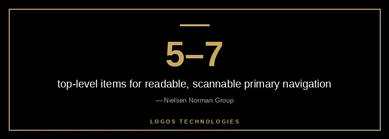
Five to seven top-level items is the sweet spot for most small-business sites. Nielsen Norman Group's research on navigation menu size traces this back to short-term memory limits and basic scannability: once you cross seven, users stop reading the menu as a coherent group and start hunting item by item. That hunting behavior is exactly what drives mis-clicks and back-button use.
There are two caveats. First, the "7±2" figure is a rule of thumb, not a law — a clean six-item menu outperforms a crowded seven-item one. Second, large e-commerce sites with genuinely deep catalogs will need dropdowns or a mega menu. The goal isn't "fewer items" for its own sake; the goal is that the top level should feel scannable at a glance.
Sticky Headers: When They Help, When They Hurt
A sticky header (the nav bar that stays pinned as you scroll) is one of the few navigation patterns with a clear conversion signal in the research. Convert's analysis of sticky-navigation A/B tests showed average lifts in the mid-single digits, and NN/G's original usability testing found participants navigate roughly 22% more quickly with a persistent header.
Sticky wins when:
- The primary CTA (call, contact, cart, quote) lives inside the header
- The site is content-heavy or has long scroll pages
- The nav is short enough to stay legible after sticking
Sticky hurts when:
- The header occupies more than 20-30% of mobile screen height
- The nav has too many items and the dropdowns overlap content
- The sticky effect is implemented with heavy JavaScript that blocks paint
On a static site built with Eleventy, the right implementation is a few lines of CSS — position: sticky; top: 0; — with no JavaScript listener on scroll. That keeps Interaction to Next Paint fast and avoids the layout thrashing that comes from custom scroll-handler code. This is the same pattern we use on every site we build, and it's one of the reasons performance-first architecture and conversion-focused design aren't in conflict — see what the page speed data actually shows for the revenue side of that tradeoff.
Mobile Navigation: Hamburger, Bottom Bar, or Hybrid?
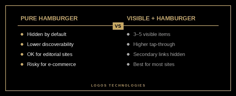
The hamburger icon won the mobile web by default, but the data on it is more nuanced than designers admit. Research summarized by CXL on the hamburger icon and revenue shows the hamburger systematically reduces discoverability: users don't tap what they can't see. That matters because on mobile, navigation clicks are a leading indicator of session depth, and session depth is a leading indicator of conversion.
The patterns that actually perform in 2026:
- Visible top nav with 3–5 critical items, plus a hamburger for secondary links. This is the hybrid approach NN/G now recommends for most consumer sites.
- Bottom tab bar for apps and app-like sites where users move frequently between sections. The thumb zone matters — tap targets belong in the lower half of the screen.
- Pure hamburger only when primary content is the focus (editorial sites, single-funnel landing pages) and nav is occasional.
Industry stats from Baymard's benchmark of US e-commerce sites show 88% use hover-activated mega menus on desktop, but that's desktop. On mobile, the same mega menu without tap-friendly subcategory pathways is often the #1 cause of subcategory abandonment. Mobile-first thinking here is non-negotiable — we break down the broader pattern in our guide to mobile-first design for SEO and conversions.
Do Breadcrumbs Still Matter in 2026?
Yes — more than they did a year ago, even though you can no longer see them in Google search results. Google removed visible breadcrumbs from desktop SERPs in September 2024 and extended the change to mobile in August 2026. A lot of SEOs assumed this meant breadcrumbs were dead. It meant the opposite.
The SearchPilot case study on breadcrumbs found that re-introducing visible on-page breadcrumbs, paired with server-side BreadcrumbList schema, produced a statistically significant 5% uplift in organic traffic. Why? Because AI crawlers — Google's AI Overview system, Bing's Copilot, and Perplexity — rely on structured hierarchy data to understand what a page is actually about. The data layer matters more now, not less. For the deeper schema story, see our schema markup SEO guide.
On a static site, breadcrumbs are trivial to implement: a small Eleventy shortcode that builds the trail from the URL path and emits the matching JSON-LD block in <head>. No client JS, no runtime cost, all the AI-search upside.
Navigation Speed: The Hidden Conversion Killer
A flawless menu on a slow site is a slow menu. Google's Core Web Vitals guidance is explicit that interaction-to-next-paint is a ranking signal, and navigation interactions are among the first a user performs. Research consistently shows that even a one-second delay in page load can reduce conversions by up to 7%.
The common failure modes for navigation performance:
- A JavaScript framework rendering the nav client-side instead of server-side, so the nav "pops in" after LCP
- A scroll listener without
{ passive: true }thrashing the main thread on every pixel - A mega-menu component that ships 50+ KB of JS to show four columns of links
- Animation libraries (GSAP, Framer Motion) loaded for a single hover effect
Static, hand-coded HTML navigation ships as zero JS. That's not an aesthetic preference — it's the reason our sites hit Core Web Vitals scores that page-builder sites can't touch without a rewrite. If you want the full performance playbook, we covered it in depth in fast website design where speed is built in, not bolted on.
The Five Navigation Tests Worth Running
If you only A/B test five things about your navigation, test these — in roughly this order of expected impact:
- Primary menu label wording — "Services" vs. "What We Do" vs. "Solutions". Label clarity typically outranks menu layout by a factor of 2–3× in conversion lift.
- Item ordering — move the highest-intent nav item (usually Contact, Pricing, or Get Quote) to the right-most desktop position. Reading-order recency does most of the work here.
- Sticky vs. non-sticky header — run it if you have a long-scroll site and a persistent CTA.
- Mobile pattern — hamburger-only vs. visible-3-plus-hamburger hybrid.
- Breadcrumb visibility — especially on category pages and deep content, where the SearchPilot 5% lift applies.
None of these require a design refresh. They're all navigation architecture changes — and if your site is static, they're deploy-in-an-afternoon changes, not two-sprint refactors.
Frequently Asked Questions
What is the ideal number of items in a website navigation menu?
Between five and seven top-level items works for the vast majority of small-business sites. This range fits short-term memory limits and keeps the menu scannable at a glance. Sites with genuinely deep catalogs should use dropdowns or a mega menu rather than adding more top-level items.
Are hamburger menus bad for conversion?
Not bad, but they reduce discoverability compared to visible nav, which hurts sites where users don't know exactly what they're looking for. The current best practice on mobile is a hybrid: 3–5 visible critical items plus a hamburger for secondary links. Pure hamburger menus are fine for editorial or single-funnel sites, but risky for e-commerce or service businesses with diverse offerings.
Do breadcrumbs still help SEO now that Google removed them from search results?
Yes. Google removed the visible breadcrumb display from SERPs, but the underlying BreadcrumbList schema is now more important for AI-driven search systems that rely on structured hierarchy data. A SearchPilot test found a statistically significant 5% organic traffic lift when visible breadcrumbs and schema were re-introduced on mobile.
Should my website have a sticky header?
Usually yes — especially if you have a long-scroll site or a primary CTA (call, contact, quote, cart) that belongs in the header. Studies show sticky navigation yields conversion lifts in the mid-single digits on average, with some e-commerce sites reaching 25% when the cart is persistent. The caveat is mobile: keep the sticky header under 20–30% of screen height.
How do I make my navigation fast on a WordPress or page-builder site?
Honestly, the ceiling is low. A WordPress site running a page-builder theme is shipping the equivalent of a small application's worth of JavaScript for nav alone. You can mitigate with caching and unused-CSS purging, but you can't fully escape the architecture. Static-site architecture — which is what we build — ships the menu as plain HTML and CSS, which means zero JavaScript runtime cost for navigation. See our WordPress alternative for small business if you want the full comparison.
Get a Navigation System That Actually Moves Visitors Toward Conversion
Navigation is usually the cheapest lever on a small-business site — one or two structural changes can outperform a full redesign for a tenth of the cost. But it has to be implemented on an architecture that doesn't undo the win with sluggish JavaScript and layout shift. At LOGOS Technologies, based in Papillion, Nebraska, we build fast, static, hand-coded websites where navigation is designed with conversion in mind and shipped as zero-runtime HTML and CSS. If your menu is driving bounces instead of clicks, check out our web design services or contact us and we'll audit your current navigation against the 2026 research.