
Website Typography Best Practices in 2026: Type That Reads Well and Loads Fast

Table of Contents
TL;DR — Quick Hits
- Set body text to at least 16px — the long-standing browser default and the size below which mobile users are forced to pinch-zoom.
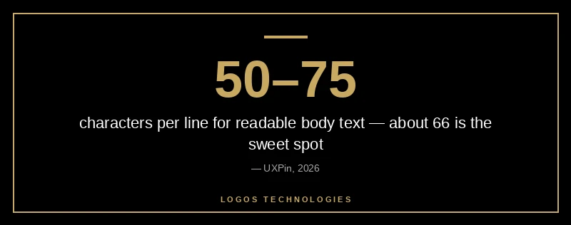
- Keep lines to 50–75 characters; about 66 is the readability sweet spot for sustained reading.
- Self-host your fonts as subset WOFF2 files — subsetting can shrink a font by 80% or more and removes a third-party connection.
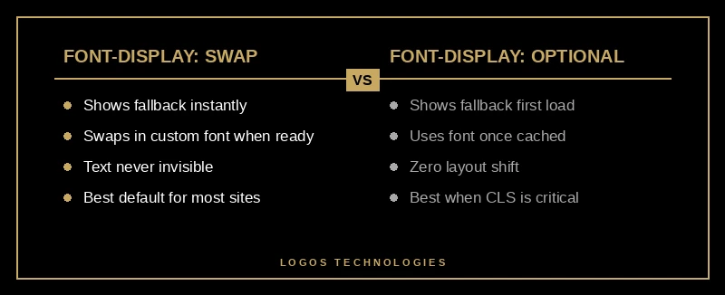
- Use
font-display: swapso text is never invisible, and addsize-adjustto your@font-facerule to stop fonts from shifting your layout. - Typography is a Core Web Vitals problem, not just a design one: late fonts hurt both LCP and CLS.
Most articles about website typography stop at "pick a nice font and make it big enough to read." That advice is fine, but it ignores half the problem. In 2026, the fonts you choose and the way you load them are scored directly by Google's Core Web Vitals — a slow or unstable font is a ranking and conversion liability, not just an aesthetic one. Readability research backs the design side: increasing line spacing from 100% to 120% has been shown to improve reading accuracy by roughly 20% and cut eye strain by about 30% during long reading sessions (Greadme readability guide). The trick is getting that readability without paying for it in load time. Good typography in 2026 means type that reads well and loads fast — and those two goals only conflict if you ignore one of them. These are the website typography best practices that matter most in 2026.
Why typography is a performance problem, not just a design choice
Web fonts block rendering and shift layout, which means they affect two of the three Core Web Vitals directly. Before any styled text can appear, the browser has to download the font file; if your largest visible element is a text headline, a slow font drags down your Largest Contentful Paint. And when a custom font finally loads and replaces the fallback, the new letterforms take up different space, jolting the page and inflating your Cumulative Layout Shift score. Google considers a CLS at or below 0.1 "good," and font swaps are one of the most common reasons sites blow past it (Semrush's CLS guide).
This is exactly why typography belongs in the same conversation as website speed optimization. The big design blogs treat fonts as a styling decision and the performance blogs treat them as a metrics decision. They are both. A genuinely professional website design handles them together — beautiful type that is engineered to load without penalty.
What are the best fonts for a fast website in 2026?
The best fonts for a fast website are well-hinted, widely-supported families served as subset WOFF2 files — or no downloaded font at all. System font stacks (the fonts already installed on the visitor's device, like San Francisco on Apple devices and Segoe UI on Windows) load instantly because nothing has to download, and they look native on every platform. When you do want a branded typeface, families like Inter, Roboto, and Open Sans are popular precisely because they balance legibility with small, well-optimized files.
The single biggest 2026 win is the variable font. Instead of loading separate files for regular, bold, italic, and their combinations, a variable font packs every weight and width into one file. Google's own guidance notes this can dramatically reduce total font size when you need multiple variants. One file, fewer requests, more typographic flexibility — it is the rare upgrade that helps both design and speed at once.
How to load web fonts without hurting Core Web Vitals
If you serve custom fonts, the loading strategy matters more than the font itself. Follow these five steps in order.
1. Self-host your fonts
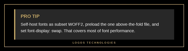
Download the files and serve them from your own domain rather than a third-party font CDN. Self-hosting eliminates an extra DNS lookup and connection to an outside server, gives you full control over caching, and sidesteps the privacy questions that come with loading fonts from a third party. On a hand-coded static site this is trivial — the font files sit right next to your CSS.
2. Convert and subset to WOFF2
WOFF2 is the modern compressed format and is significantly smaller than older formats. Then subset each file so it contains only the characters and language ranges your site actually uses. A full font with every glyph for dozens of languages is wasteful when your site is in English — subsetting can shrink a file by 80% or more (web.dev on reducing web font size).
3. Preload the one critical font
Add a single <link rel="preload" as="font" crossorigin> for the font your above-the-fold text needs first, so the browser fetches it early instead of discovering it deep in your CSS. Preload sparingly — preloading every weight competes with your hero image for bandwidth and can actually slow your first paint (web.dev font best practices).
4. Set font-display deliberately
The font-display descriptor decides what happens while a font loads. Use font-display: swap to show a readable fallback immediately and swap in the custom font when it arrives — text is never invisible. If you care more about zero layout shift than about the font appearing on the very first load, font-display: optional shows the fallback and only uses the custom font once it is cached, so the first visit never shifts.
5. Match fallback metrics with size-adjust
The reason a swap shifts your layout is that the fallback font and the web font occupy different amounts of space. Fix it with size-adjust, ascent-override, and descent-override in your @font-face rule so the fallback takes up exactly the same room as the real font. Google describes this as the way to "customize the text bounding box" and avoid the swap-induced shift (web.dev on CSS size-adjust). Done right, the font change becomes invisible — no jump, no CLS hit.
Typography rules that actually move conversions
Once your fonts load cleanly, the readability rules do the heavy lifting on engagement. Set body text to a minimum of 16px — that has been the default body size in every major browser for two decades and is the threshold below which mobile users are forced to pinch-zoom (learnui.design font size guidelines). On desktop, 18–20px is often more comfortable for long-form reading.
Control your line length. Lines that run the full width of a wide screen are exhausting to read; aim for 50–75 characters per line, with about 66 cited as the ideal (UXPin on optimal line length). Pair that with a line height around 1.5 for body copy to give the text room to breathe. These website typography best practices are part of what separates a professional website design from a templated one — the readability that keeps people on the page. And because most traffic is now mobile, every one of these values should scale down responsively — type that is comfortable on a 27-inch monitor is cramped on a phone, which is the same principle behind sound mobile-first design.
Frequently Asked Questions
Should I use Google Fonts or self-host my fonts?
Self-hosting is the better choice for most sites in 2026. Serving fonts from your own domain removes a third-party connection, gives you full caching control, and avoids the privacy concerns of loading from an outside server. You can still use a Google font — just download it and host the WOFF2 files yourself rather than linking to the Google Fonts CDN.
What font size is best for body text in 2026?
Use at least 16px for body text on mobile, and 18–20px is often more comfortable on desktop. 16px is the long-standing browser default and the point below which phones force users to pinch-zoom, so going smaller hurts both readability and your mobile usability signals.
Does font choice affect SEO?
Indirectly, yes. Fonts do not contain keywords, but a slow-loading or layout-shifting font degrades your Largest Contentful Paint and Cumulative Layout Shift scores, which are part of Google's Core Web Vitals ranking signals. Choosing a small, self-hosted, well-loaded font protects those metrics.
What is the best font-display value to use?
Use font-display: swap for most sites — it shows readable fallback text immediately and never leaves text invisible. Choose font-display: optional instead when avoiding any layout shift on first load matters more than showing your custom font on the very first visit.
Get typography that reads beautifully and loads instantly
Typography is one of the clearest places where design and performance either work together or fight each other, and the website typography best practices above are how you keep them aligned. At LOGOS Technologies, we hand-code fast, static websites here in Papillion, Nebraska, where the fonts are self-hosted, subset, and loaded to keep Core Web Vitals clean from day one — no plugins bolting on layout shift after the fact. If your site's text looks fine but loads slow or jumps around as it renders, take a look at our web design services or contact us and we will show you what type that reads well and loads fast looks like on your own pages.