Call-to-Action Button Design That Converts: A 2026 Field Guide

Table of Contents
TL;DR — Quick Hits
- Contextual, personalized CTAs convert 202% better than generic one-size-fits-all buttons (HubSpot, 330,000 CTAs).
- WCAG 2.2 sets a 24×24 CSS pixel minimum for tap targets; Google recommends ~48×48 px with 8px spacing.
- Contrast beats color: there is no magic "best" button color, only a button that stands out from its surroundings.
- One clear primary CTA above the fold outperforms a page cluttered with competing buttons.
- A CTA that lags or shifts on tap loses the click — responsiveness is a conversion factor, not just a performance one.
Most advice about call-to-action buttons stops at "use a contrasting color and action words." That is true, but it is also the reason so many CTAs still underperform: the details that actually move conversion rates are more specific. HubSpot analyzed more than 330,000 CTAs over six months and found that personalized, contextual buttons convert 202% better than default ones. That is not a color tweak — it is a design decision about relevance, hierarchy, and how the button meets the visitor.
Good call-to-action button design is where visual design and conversion meet. It is one of the highest-leverage elements on any page, and it is often the last thing that gets real attention. This guide covers what actually makes a button convert in 2026 — sizing, contrast, copy, placement — plus the one factor most CTA articles leave out entirely.
What makes a call-to-action button convert?
A call-to-action button converts when it is instantly visible, unambiguous about what happens next, effortless to tap, and singular in its priority. Those four properties — contrast, clarity, tap-ability, and focus — do more than any single color or word choice. Effective call to action button design is mostly about getting these four right; everything else is refinement on top of them.
Contrast makes the button findable in the half-second a visitor scans the screen. Clarity — a label built from a verb and a benefit — removes the hesitation of "what am I signing up for?" Tap-ability means the button is large enough and spaced enough to hit on the first try. And focus means the page is not asking the visitor to choose between five equally-weighted actions. This is the same discipline behind strong visual hierarchy in web design: the most important action should look like the most important action.

This is also why CTA design is inseparable from the broader question of professional website design that converts. A beautiful page with a weak button leaks the very traffic it worked to earn. The button is where design either pays off or doesn't.
How big should a CTA button be?
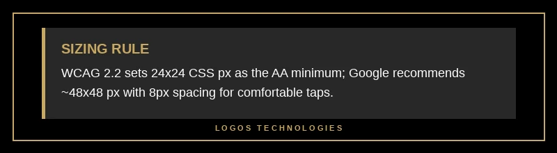
A CTA button should be at least 24×24 CSS pixels to meet the WCAG 2.2 accessibility minimum, and closer to 48×48 pixels for comfortable real-world tapping. The W3C's Success Criterion 2.5.8 Target Size (Minimum) sets 24×24 CSS pixels as the Level AA floor for interactive targets. That is a floor, not a goal.
For a primary CTA, aim higher. Google's guidance on accessible tap targets recommends a minimum touch target of around 48×48 device-independent pixels — roughly 9mm, about the size of a finger pad — with about 8 pixels of spacing between targets so a thumb does not accidentally trigger the wrong one. On mobile, where the majority of small-business traffic now lands, an undersized button is a silent conversion killer. A button can be perfectly worded and perfectly colored and still fail because it is a hair too small to hit on the first tap.
How do you design a call-to-action button that converts?
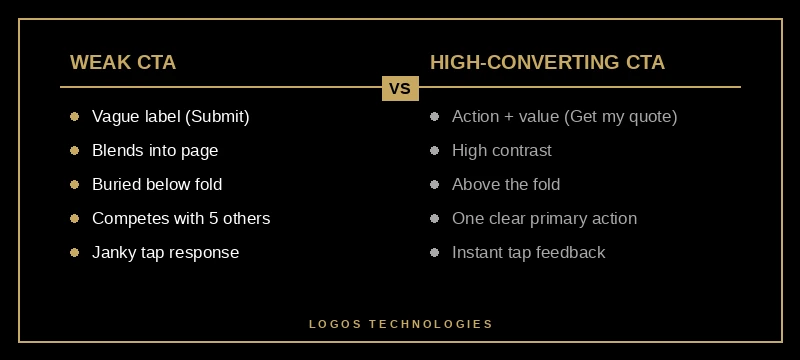
Designing a CTA button that converts comes down to five steps: write the label around a verb and a benefit, make it the highest-contrast element in view, size it for thumbs, give it one clear job above the fold, and make the tap feel instant. Work through them in order and the button will outperform most of its competition.
1. Write the label around a verb and a benefit
Start the text with an action and name the payoff. "Get my free quote" beats "Submit" because it tells the visitor exactly what they get and frames it as theirs. Generic labels like "Click here" or "Learn more" waste the most valuable few words on the page.
2. Make it the highest-contrast element in view
The primary CTA should be the single most visually prominent thing in its section. That usually means a solid fill in a color that appears nowhere else nearby, with text that passes contrast checks. If everything on the page is bold, nothing is — the same principle that governs good color contrast and accessibility.
3. Size it for thumbs, not cursors
Meet the WCAG minimum, target Google's ~48px recommendation, and keep spacing generous. Design for the phone first; a button that is easy to tap with a thumb is always easy to click with a mouse. The reverse is not true.
4. Give it one clear job above the fold
Place the primary CTA where it is visible without scrolling — the logic behind strong above-the-fold web design — and resist adding competing primary buttons. Secondary actions can exist, but they should look secondary. Semrush's guidance on conversion rate optimization is blunt on this point: make the button stand out, state clearly what happens on click, and test its text, color, size, and placement.
5. Make the tap feel instant
A button that visually shifts as the page loads, or lags for 200 milliseconds after the tap, undercuts every other decision you made. More on this below — it is the factor most CTA guides skip.
Does button color actually matter?
Button color matters only as a tool for contrast — there is no universally best CTA color. The famous example is a HubSpot A/B test in which a red button outperformed a green one by 21%, which gets quoted endlessly as "red converts best." It doesn't. Red won that specific test because the surrounding page was green, so red was the high-contrast outlier.
The takeaway is the opposite of a color rule: pick whatever color makes your button the standout element against its own background, keep it consistent as your single "action" color across the site, and verify it passes accessibility contrast. Then test it against your real audience rather than trusting a stat from someone else's page. Color is a lever for attention, not a spell.
The speed factor most CTA advice ignores
The most overlooked CTA design factor is responsiveness: a button that shifts position while the page loads or lags after a tap loses conversions no copy can recover. You can nail the label, contrast, size, and placement and still lose the click if the button is not there when the finger arrives, or does not respond the instant it is pressed. Conversion articles almost never mention this because they treat the button as a static graphic, but call to action button design in 2026 has to account for how the button behaves, not just how it looks. It isn't — it is an interactive element governed by how the page is built.
Two things quietly wreck CTAs on slower, script-heavy sites. First, layout shift: if a late-loading ad, banner, or font bumps the button down half a second after the visitor commits to tapping, they either miss or hit the wrong thing. Second, input delay: heavy JavaScript can block the main thread so the tap registers late, which is exactly what Google's Interaction to Next Paint metric measures. A button that feels sluggish feels untrustworthy.
This is where how a site is built shapes whether its buttons convert. On a lean, hand-coded static site, the CTA is in its final position from the first paint and responds instantly because there is little competing script — the same architecture that powers a fast landing page design that converts. Design and engineering are not separate concerns here — this is exactly what separates professional website design that converts from work that merely looks the part. The best-designed button in the world still needs an interface fast enough to honor the moment someone decides to act.
Frequently Asked Questions
Where should I place my main call-to-action?
Place your primary CTA above the fold so it is visible without scrolling, and repeat it further down on longer pages. Position it near the headline or the end of a persuasive section, where a visitor has just absorbed the reason to act. On long pages, a single repeated primary action outperforms scattering different asks throughout.
What is the best call-to-action button color?
There is no single best color — the best color is whichever one makes your button stand out most against its surroundings while passing accessibility contrast checks. Contrast, not a specific hue, drives visibility. Choose one consistent action color for your site and test it with your own audience rather than copying another brand's result.
How many CTAs should a page have?
A page should have one clear primary call to action, repeated if the page is long, with any additional actions styled as visibly secondary. Multiple competing primary buttons force a decision and dilute clicks. Give the visitor one obvious next step and make everything else clearly lower priority.
What makes good CTA button text?
Good CTA text starts with a verb and names the benefit, staying specific and short — "Get my free quote" or "Start my project" rather than "Submit" or "Click here." First-person, benefit-led wording frames the action as the visitor's own. Avoid vague labels that make people guess what happens next.
Get a Website Where Every Button Earns Its Click
At LOGOS Technologies, based in Papillion, Nebraska, we build fast, hand-coded websites where call-to-action button design is treated as an engineering decision, not an afterthought — buttons that are visible, tappable, accessible, and instant, on a site that loads before your visitor loses interest. If your current site looks fine but isn't turning traffic into calls and quotes, the button is often the leak. See how we approach this on our web design services page, or contact us to talk through your site. Design that converts starts with the moment someone decides to click.