Visual Hierarchy in Web Design: How to Guide a Visitor's Eye in 2026

Table of Contents
TL;DR — Quick Hits
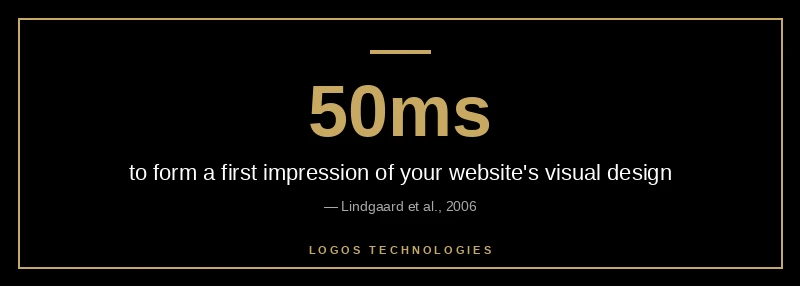
- Visitors form a first impression of your site's visual design in about 50 milliseconds — hierarchy is what they react to before they read a word.
- Visual hierarchy is built with five levers: size, contrast, spacing, alignment, and typography. Use them deliberately, not by accident.
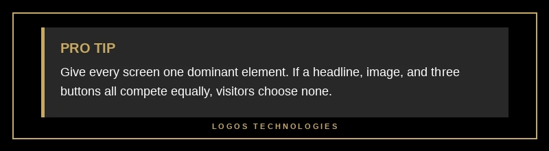
- Give every screen exactly one dominant element. If everything shouts, nothing gets heard.
- Strong headings turn aimless F-pattern skimming into the "layer-cake" scan — the most effective way users read a page.
- Contrast is both a hierarchy tool and an accessibility requirement: aim for at least a 4.5:1 text contrast ratio.
A visitor decides whether your website looks credible in roughly 50 milliseconds — about one-twentieth of a second, faster than they can consciously read anything (Lindgaard et al., 2006). In that instant, no one is parsing your value proposition. They are reacting to the overall shape of the page: what is big, what is bright, what their eye lands on first. That reaction is governed by visual hierarchy, and it is one of the most underrated levers in web design. Get it right and visitors flow naturally from your headline to your offer to your call to action. Get it wrong and even great copy sits unread.
Visual hierarchy in web design is the deliberate arrangement of elements so people instantly understand what matters most. It is the difference between a page that guides and a page that overwhelms. Below is what it is, why it decides whether visitors convert, and exactly how to build it in 2026.
What is visual hierarchy in web design?
Visual hierarchy in web design is the order in which the eye perceives elements on a page, controlled by how those elements are sized, colored, spaced, and arranged. It is the visual system that tells a visitor "look here first, then here, then here" without a single instruction. When the hierarchy is clear, a stranger can land on your homepage and know within a second what the page is about and what to do next.
Designers create that order with five core signals. Size and scale establish importance — bigger reads as more important. Contrast in color and value pulls the eye toward focal points. Spacing and white space group related items and separate unrelated ones. Alignment builds an underlying structure the eye can follow. And typography — weight, case, and style — clarifies the levels of meaning between a headline, a subhead, and body text. Master those five and you control where attention goes. This is the same discipline that underpins any professional website design that converts: the visuals are doing a job, not just decorating the page.
Why visual hierarchy decides whether visitors convert
Visual hierarchy decides conversions because attention is the scarcest resource on any web page, and hierarchy is how you spend it. A staggering 75% of users admit to judging a company's credibility based on its website design (Stanford Web Credibility Project) — and in those first milliseconds, "design" means hierarchy and visual order, not the cleverness of your wording. A cluttered page with no clear focal point reads as untrustworthy before a visitor consciously evaluates anything.
Hierarchy also controls the path to action. The best-performing pages make exactly one action feel obviously primary while keeping secondary options available but quieter. When you give a page a single dominant call to action, you remove the cognitive load of choosing, and conversion-rate optimization work consistently shows that reducing decision friction lifts results (Semrush's CRO guide). This is why hierarchy and landing page design that converts are inseparable — a landing page is just hierarchy pointed at one goal.
How to build visual hierarchy on a web page
To build visual hierarchy, work through five levers in order: size, contrast, spacing, alignment, and a single clear action. Do them deliberately rather than hoping a nice template handles it for you — deliberate control over these levers is exactly what separates professional website design from a page that simply exists.
1. Set a clear size and scale order
Pick the single most important element on each screen and make it visibly the largest, then step everything else down. A hero headline should dwarf the subhead, which should outweigh body text, which should sit above fine print. Inconsistent sizing — where three things are all "kind of big" — is the most common reason a page feels noisy. Decide what wins, and let it win clearly. What earns that top spot is the same question behind what belongs above the fold.
2. Use contrast to create focal points
Contrast is what makes the eye stop. Give your primary action the strongest color and value contrast on the page so it is the first thing a visitor notices, and keep secondary links and buttons in lower-contrast styling. Contrast is also an accessibility requirement, not just an aesthetic one: text should hit a contrast ratio of at least 4.5:1, and large text at least 3:1 (web.dev color and contrast). That overlap is convenient — the same contrast that guides the eye also keeps your page readable for everyone, which we cover in depth in our guide to website color contrast.
3. Group elements with spacing and white space
Spacing tells the eye what belongs together. Put generous space between unrelated blocks and tighter space between related ones, and a visitor reads the structure without thinking about it. White space is not empty space wasted — it is the breathing room that lets your dominant elements stand out. Cramped pages bury their own hierarchy; spacious ones let it speak.
4. Align everything to a consistent grid
Align elements to a shared grid with consistent margins and edges. Clean alignment creates an invisible scaffold the eye follows effortlessly, and it is a quiet trust signal — misaligned, ragged layouts read as careless. A consistent grid is also what keeps your hierarchy intact across screen sizes, which is the heart of responsive design done well.
5. Make one action the obvious next step
End every screen with one dominant call to action. If a headline, an image, and three buttons all compete equally, the visitor chooses none of them. Decide what you most want someone to do on that page and make that path unmistakable — bigger, brighter, and surrounded by enough white space to stand alone.
How do users actually scan a page?
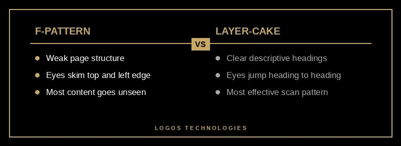
Users do not read web pages top to bottom — they scan in predictable patterns, and your hierarchy determines which pattern they fall into. On text-heavy pages with weak structure, eyes trace an F-pattern: a sweep across the top, a shorter sweep lower down, then a vertical scan down the left edge, leaving most of the page unseen (Nielsen Norman Group). The F-pattern is what happens when a page gives the eye nothing better to do.
Strong hierarchy replaces it with the layer-cake pattern, where the eye jumps cleanly between meaningful headings and subheadings, reading the supporting text only where it matters. NN/g found the layer-cake to be one of the most effective ways users can scan a page (Nielsen Norman Group on layer-cake scanning). The lever that produces it is clear, descriptive headings — which is also why header tags and scannable structure matter for both readers and search engines. Good website typography does the same work at the paragraph level.
Frequently Asked Questions
What are the elements of visual hierarchy?
The core elements are size and scale, color and contrast, spacing and white space, alignment, and typography. Size signals importance, contrast pulls the eye to focal points, spacing groups related items, alignment provides structure, and typography clarifies the levels between headlines, subheads, and body text. Used together, they tell a visitor what to look at and in what order.
How does visual hierarchy affect SEO?
Visual hierarchy affects SEO indirectly but meaningfully. Clear heading structure (H1, then H2s and H3s) helps both users scan and search engines understand your content's organization, and strong scannability keeps visitors engaged instead of bouncing. The headings that create a good reading hierarchy are the same ones that help you win featured snippets and AI Overview citations.
What is the difference between the F-pattern and the Z-pattern?
The F-pattern describes how people scan text-heavy pages — two horizontal sweeps near the top and a vertical scan down the left. The Z-pattern applies to simpler, less text-dense pages, where the eye moves top-left to top-right, then diagonally to bottom-left and across to bottom-right. Both are tools for placing key elements where eyes naturally travel.
How do I fix a page with poor visual hierarchy?
Start by naming the single most important element on the page and making it clearly the largest and highest-contrast item. Then add white space to separate unrelated sections, align everything to a consistent grid, and reduce competing calls to action down to one. Most hierarchy problems come from too many things demanding equal attention.
Make your pages guide visitors instead of overwhelming them
Visual hierarchy is the quiet engine behind every page that feels effortless to use — and it is almost always missing from pages that don't convert. If your site looks busy, reads as cluttered, or buries its main action among a dozen competing elements, the fix is rarely more content; it is better order. At LOGOS Technologies, we hand-code fast, static websites here in Papillion, Nebraska, where hierarchy is built in from the first wireframe so every page points a visitor toward the one thing that matters. If your pages aren't pulling the eye where you need it, take a look at our web design services or contact us and we'll show you what deliberate hierarchy looks like on your own site.