

Homepage Design Best Practices for 2026: 8 Principles That Convert Visitors Into Customers

Table of Contents
TL;DR — Quick Hits
- Visitors form an aesthetic judgment of your homepage in 50 milliseconds — before they read a single word.
- A clear value proposition above the fold is the single highest-leverage element on the page; pages with an above-the-fold CTA convert about 17% better.
- Your hero image is almost always the LCP element — preload it, set
fetchpriority="high", and keep it under 200KB. - 53% of mobile visitors abandon a homepage that takes longer than three seconds to load. Your homepage is your speed problem.
- Visual consistency (same colors, type, button shapes) can drive up to 23% more revenue — pick a system and hold the line.
The first 50 milliseconds of your homepage do more for conversion than the next 50 minutes. That's not opinion — it's a HCI research finding that has been re-validated in every modern eye-tracking study since. By the time a visitor has read your first sentence, their gut has already decided whether your business looks credible. That makes the homepage the highest-leverage page on a small business website — and it makes most of the homepage advice on the first page of Google ("use a clear value proposition," "have a CTA above the fold") incomplete in 2026.
This guide pulls from current Core Web Vitals data, modern conversion research, and the realities of the 2026 search environment, where AI Overviews appear on roughly 16% of Google searches and AI-search visitors convert about 4.4x better than vanilla organic. The shape of a homepage that wins now is different from the one that won in 2022. These are the homepage design best practices that actually move the needle.
What is the most important element of a homepage?
The hero section — specifically the headline, subheadline, and primary CTA visible above the fold — is the most important element of a homepage. Above-the-fold copy determines whether a visitor scrolls or bounces, and pages with an above-the-fold CTA convert about 17% better than pages where the CTA only appears after scrolling, according to landing page benchmarks. Everything else on the homepage is supporting evidence for the claim the hero is making.
The trap most small business homepages fall into is treating the hero like a brand statement instead of a sales page. "Welcome to Acme Plumbing — Family Owned Since 1992" is brand. "We unclog drains same-day, flat-rate, no surprises." is a hero that converts. A hero must answer three questions in under five seconds: what do you sell, who is it for, and what's the next step. If a visitor can't answer all three at a glance, the hero is broken.
We covered the mechanics of this in our breakdown of above the fold web design — the headline-subhead-CTA stack does the heaviest lifting on the page, and most homepages waste it on a stock photo of a handshake.
How fast does a homepage need to load?
A homepage needs to load in under three seconds, and ideally under two. 53% of mobile users abandon sites that take longer than three seconds to load, and a one-second delay in load time can reduce conversions by roughly 7%. In 2026, Google's Core Web Vitals are not aspirational targets — they are the floor. Failing them costs rankings and revenue at the same time.
The single biggest performance lever on a homepage is the hero image, because it's almost always the Largest Contentful Paint (LCP) element. Three things to do on every hero image: serve it as WebP or AVIF, preload it with <link rel="preload" as="image" href="..." fetchpriority="high">, and keep the file size under 200KB. If you're loading a 2MB JPEG into your hero on mobile, your homepage cannot pass Core Web Vitals, full stop — and no amount of design polish will out-run that handicap. We unpacked this in page load time: what fast actually means in 2026.
The second-biggest lever is third-party scripts. Live-chat widgets, marketing pixels, and heatmap scripts each add 100-300ms of main-thread blocking. They belong inside requestIdleCallback or behind a defer, never in the head as render-blocking script tags. This is a common piece of professional website design that gets ignored because the page looks fine in development — and then degrades the moment marketing adds the seventh tracking pixel.

Designing for the 50-millisecond aesthetic judgment
Research summarized by Nielsen Norman Group on homepage design principles reinforces what HCI studies have shown for years: users form opinions about a website's aesthetic appeal and perceived usability in under 50 milliseconds — faster than they can consciously parse a single word. Three implications.
First, visual consistency matters more than visual creativity. Consistency in colors, typography, and button shapes can drive up to 23% more revenue. A page that uses three different button styles and two shades of "brand blue" reads as amateur in 50ms, even if each element is well-designed. Pick a system, hold the line.
Second, whitespace is a performance feature. Cluttered homepages read as low-credibility before the brain processes content. The homepages of every category-defining brand — Stripe, Apple, Notion — are ruthlessly empty.
Third, alignment and grid discipline beat decoration. Use exactly three vertical rhythm values throughout the page (e.g., 16px, 32px, 64px) and never deviate. This costs nothing and is what their gut is reading in those first 50 milliseconds.
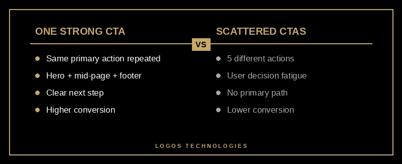
How many CTAs should a homepage have?
A homepage should have one primary CTA and 2-3 secondary CTAs, no more. The primary CTA appears in the hero, repeats once mid-page after social proof, and closes the page. Secondaries cover lower-intent steps: "See pricing," "Read case studies," "Browse our work."
The mistake is treating every block as a chance for a different CTA. "Schedule a demo" / "Get a free quote" / "Book a call" is three conversion paths fighting each other. Pick the one that matters most and repeat it at every reasonable scroll point. We dug into this in website conversion optimization.
CTA copy matters as much as placement. "Submit" and "Learn more" are dead. Specific verbs win: "Get my free quote," "Start my free trial," "See available times." The CTA should restate what the visitor gets, not what they do.
Trust signals: the homepage's secret conversion lever
Most lists of homepage design best practices stop at "show some testimonials" and move on. That's a missed lever. Visitors arriving from Google or an AI Overview have not pre-vetted you. The job of the homepage is to compress 30 minutes of "is this business legit?" into 30 seconds of scrolling. The five trust signals that move the needle:
- Customer testimonials with full name, photo, and role. Anonymous or first-name-only testimonials are read as fabricated. A testimonial with "Sarah Greene, Owner of Greene & Co. Roofing" is read as real.
- Logos of recognizable clients or publications. "As featured in" rows work — but only if the logos are recognizable to your target customer. Six unknown logos look weaker than zero.
- Specific numbers, not adjectives. "Trusted by hundreds of small businesses" loses to "Built and ranks 73 small business sites since 2019."
- A real person, with a real face. A photo of the owner, a name on the site, and a real "About" link cuts perceived risk in half. Faceless homepages bleed conversions.
- Recent dates. A "Last updated 2024" footer kills credibility. A "Posted 3 days ago" blog teaser builds it. Recent content is itself a trust signal.
Trust signals belong above the fold, repeated in the middle (full testimonials), and ideally in the closer. Spread them across the page — don't bury them all in one "testimonials" section.
Mobile is the homepage now
60%+ of homepage traffic is mobile in 2026. Your homepage is mobile, and the desktop version is the secondary experience. If you're designing in Figma at 1440px and "making it responsive" at the end, you're designing for the minority of your traffic. Reverse the order. We covered this transition in mobile-first design.
What changes on mobile specifically:
- Hero stacks. Image above or below the headline — never side-by-side at small breakpoints.
- Headline shortens. A 14-word desktop headline reads as a wall on a phone. Aim for 6-10 words on mobile.
- CTA button gets bigger. Minimum 48x48px tap target per Google guidelines.
- Nav becomes a hamburger. More than 5-7 top-level items must collapse. See website navigation design that converts.
- No hover effects. Anything that depends on hover needs a tap or default-expanded alternative on mobile.
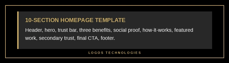
What does a 2026-ready homepage look like?
If you're building from scratch, the homepage design best practices that consistently win share one underlying structural template. It works for about 80% of small business homepages:
- Sticky header — logo top-left, 5-7 nav links, primary CTA top-right.
- Hero — H1 value prop, subheadline (who + proof), primary CTA, one image. No carousel.
- Trust bar — thin horizontal row of customer logos or "4.9 stars on Google" copy.
- Three-up benefit grid — three cards, one sentence each, no jargon.
- Social proof block — 1-3 testimonials with full names and photos.
- How-it-works — a numbered 3-step process with concrete verbs.
- Featured work — 3-6 case studies, projects, or product highlights.
- Secondary trust signal — a stat, an award, or a press mention.
- Final CTA section — primary CTA repeated, secondary "talk to us" link.
- Footer — contact info, services, blog, legal.
This structure isn't creative. It's correct. The creativity goes into how you fill each block — not into reinventing the order. That's the difference between professional website design and a drag-and-drop template 800 other small businesses also have.
Frequently Asked Questions
How long should a homepage be?
A homepage should be 5-10 scroll lengths on mobile (roughly 3000-6000 pixels of total height). Shorter homepages convert better for simple, high-intent offers (service businesses, single products). Longer homepages work for complex products that need education before conversion (B2B SaaS, enterprise services). Err on the shorter side — anything past the seventh scroll is rarely viewed.
Should my homepage have a video in the hero?
Only if the video loads in under two seconds, autoplays muted, and is under 15 seconds long. Wistia engagement research shows autoplay video attention drops sharply after 15 seconds, and a slow video hero can blow your LCP score and cost you Core Web Vitals at the same time. For most small businesses, a high-quality static image is the safer, faster choice.
How often should I redesign my homepage?
Plan a serious refresh every 2-3 years and a content refresh every 6-12 months. The structural template doesn't change much — trust signals, language, and design polish age fastest. We have a longer take on timing in our guide on website redesign.
Is a hero carousel ever a good idea?
No. Carousels look productive in stakeholder reviews and are unanimously panned by every UX research group that has tested them. Multiple studies have found that the first slide gets the overwhelming majority of clicks and the rest are essentially invisible. If you have three things to say, three sections beat one carousel.
Do I need a different homepage for mobile and desktop?
No — you need a single responsive homepage that adapts intelligently. Two separate designs double the maintenance, double the bugs, and confuse Google's mobile-first indexing. A well-built responsive homepage on a fast static foundation handles both contexts cleanly.
What's the single biggest homepage mistake small businesses make?
Burying the value proposition. The most common pattern when auditing existing small business homepages: a nice hero image, a vague tagline like "Building Tomorrow Together," and zero indication of what the business actually does. Visitors leave in under three seconds. Fix: state, in plain English, what you do and who it's for, in the first sentence on the page.
Building it right from the start
Most homepage problems are foundation problems. A homepage built on WordPress with a heavy theme and 30 plugins will never hit Core Web Vitals targets, no matter how clean the design looks. A homepage built on a fast static foundation — hand-coded HTML and CSS, optimized images, minimal JavaScript — passes Core Web Vitals by default and gives you headroom to add trust signals, animations, and analytics without a performance tax.
That's the kind of homepage we build at LOGOS Technologies — fast, hand-coded sites for small businesses across the country, run out of Papillion, Nebraska. If your current homepage is slow, generic, or quietly costing you conversions, see our web design services or contact us for a free review. We'll tell you in plain English which of these eight homepage design best practices your current site is missing.