
Web Font Optimization: How to Stop Fonts From Slowing Your Site Down in 2026

Table of Contents
TL;DR — Quick Hits
- The median web page ships roughly 35 KB of font data, and WOFF2 now accounts for about 65% of all font requests — yet most sites still load them inefficiently.
- Web fonts hurt two Core Web Vitals at once: they delay text rendering (LCP) and cause layout shifts when they swap in (CLS).
- WOFF2 compresses about 30% smaller than the older WOFF format, so serving anything else is wasted bandwidth.
- Use
font-display: swapfor headlines andfont-display: optionalfor body text — optional guarantees zero font-swap layout shift. - Self-hosted, subset, preloaded WOFF2 fonts are the fastest setup — and the default on a hand-coded static site.
Fonts are the part of your page nobody thinks about until they're the reason it loads slowly. According to the HTTP Archive Web Almanac, the median web page now ships around 35 KB of font data, and WOFF2 makes up roughly 65% of all font requests. That doesn't sound like much — until you remember that fonts are render-critical. Until the browser has them, it often refuses to paint your text at all.
That makes web font optimization one of the highest-leverage speed wins most small business sites are leaving on the table. Fonts touch two of Google's three Core Web Vitals: they can delay Largest Contentful Paint and trigger Cumulative Layout Shift. Get them right and you remove a bottleneck that no amount of image compression or caching can paper over. This guide is one piece of our larger website speed optimization playbook, zoomed all the way in on the fonts.
Why do web fonts slow down your site?
Web fonts slow your site down because they're render-blocking by default: most browsers hide your text until the font file arrives, then shift your layout when the real font replaces the fallback. While a font downloads, browsers typically render nothing in its place — and Safari will keep your text hidden until the font shows up. A visitor on a slow connection ends up staring at a blank space where your headline should be.
The damage lands on two metrics. If your largest above-the-fold element is text — a hero headline, a tagline — a slow font directly delays your Largest Contentful Paint. Then, when the web font finally loads and reflows the text, you get exactly the kind of layout shift that wrecks your CLS score. Fonts are render-blocking resources in the same way unoptimized stylesheets and scripts are, which is why they belong in the same conversation as eliminating render-blocking resources.

How to optimize web fonts in 5 steps
Web font optimization comes down to five moves: self-host WOFF2, subset to the glyphs you use, preload the critical fonts, choose the right font-display value, and match your fallback metrics. Done together, they take fonts off the critical path instead of leaving them parked in front of your content.
1. Self-host and serve WOFF2 only
Serve your fonts from your own domain in WOFF2, and drop every older format. WOFF2 uses Brotli compression and is about 30% smaller than WOFF, with browser support now effectively universal — Google's guidance is to use WOFF2 and forget the rest. Self-hosting also removes the third-party handshake that loading from a font CDN requires, so the file starts downloading sooner.
2. Subset fonts to the characters you actually use
A font file carries a glyph for every character it supports, and you almost never need all of them. Latin fonts typically run 100 to 1,000 glyphs while CJK fonts can exceed 10,000. Subsetting strips out the glyphs your pages never render — pairing a unicode-range descriptor with a Latin-only subset can shrink a file dramatically. Tools like glyphhanger and subfont automate it.
3. Preload your critical fonts
Tell the browser about your most important fonts early with a <link rel="preload"> hint so it starts downloading them before it finishes parsing your CSS. The catch: preload aggressively and you steal bandwidth from everything else, so web.dev recommends limiting it to the one or two fonts used above the fold and always pairing it with the crossorigin attribute for font files.
4. Set the right font-display value
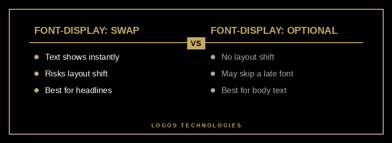
The font-display descriptor tells the browser what to do while a font loads. Use font-display: swap for headlines so text appears instantly in a fallback, and font-display: optional for body copy so a slow font never shifts your layout. Picking the right value per font family is the difference between a clean load and a visible flash — more on choosing below.
5. Match your fallback font to your web font
The layout shift happens because your fallback font and your web font take up different amounts of space. Close that gap with the CSS metric overrides — size-adjust, ascent-override, descent-override, and line-gap-override — so the fallback occupies the same footprint and nothing reflows when the real font swaps in. This is the single most effective way to keep fonts from hurting your CLS.
Which font-display value should you use?
Use font-display: swap for headlines and branding, and font-display: optional for body text. Swap shows your text immediately in a fallback — zero block time — and swaps the web font in whenever it arrives. Optional gives the font a roughly 100-millisecond window and otherwise sticks with the fallback for good, which guarantees no font-swap layout shift.
The tradeoff is aesthetics versus stability. swap always renders your branded font, but if it arrives late the visible reflow counts against your CLS. optional protects CLS completely, at the cost of occasionally skipping your web font on a slow connection. block — the value many sites land on by accident — delays text the longest and still risks a shift. The simplest rule: protect the words people read first with swap, and protect the bulk of the page with optional.

Should you self-host fonts or use Google Fonts?
Self-host your fonts. Loading them from Google Fonts means a separate connection to a third-party origin — one host for the CSS, another for the files — and that handshake costs time before a single glyph downloads. If you do use a third-party provider, preconnect to its origin so the connection is ready early; if you host the files yourself, you skip that round-trip entirely.
On a hand-coded static site, this is the path of least resistance rather than an optimization project. The font files live in your assets folder, the @font-face declarations sit inlined in the document head, and the critical font is preloaded from the same origin as the page — no plugin, no external request, no surprise. It's the same principle behind image optimization for website speed: own your assets, serve them lean, and put them on the critical path only where they belong. Google's published targets — an LCP under 2.5 seconds, CLS under 0.1, and INP under 200 milliseconds — are the scoreboard. This is exactly why we build on static architecture: it makes website speed optimization the default state instead of a recurring fight. If you're tuning fonts, it's worth auditing your full Core Web Vitals picture and your typography choices in the same pass.
Frequently Asked Questions
Does web font optimization really affect SEO?
Indirectly, yes. Fonts feed into Largest Contentful Paint and Cumulative Layout Shift, both of which are Core Web Vitals that Google uses as ranking signals. A faster, more stable page also keeps visitors from bouncing, and that engagement reinforces the ranking. Optimizing fonts won't outrank great content, but slow fonts can quietly hold good content back.
How many web fonts is too many?
There's no hard limit, but every additional font family and weight is another file on the critical path. Most well-built sites get by with one or two families and two or three weights. The fastest font is the one you never request — system font stacks and variable fonts are both good ways to cut the count without losing design flexibility.
Is WOFF2 supported in all browsers?
Effectively, yes. WOFF2 is supported across all modern browsers, which is why current guidance is to serve WOFF2 only and skip older formats entirely. Visitors on genuinely ancient browsers simply see your fallback font, which a solid fallback strategy already handles gracefully.
Will a system font stack always be faster than a web font?
In raw load time, yes — a system font is already installed, so there's nothing to download and nothing to block rendering. The question is whether the design tradeoff is worth it. System fonts are an excellent choice for body text where speed matters most, while a carefully optimized web font can be reserved for headlines and branding where the visual identity earns its weight.
At LOGOS Technologies, we hand-code fast, static websites from Papillion, Nebraska, where optimized fonts are built in from the first commit rather than bolted on later. If your site's text takes a beat too long to appear, or jumps around as it loads, that's a fixable problem, and web font optimization has a clear set of steps behind it. Take a look at our web design services to see how we approach performance, or contact us and we'll tell you exactly what your fonts are costing you.