

Image Optimization for Website Speed: The 2026 Playbook That Actually Moves LCP

Table of Contents
TL;DR — Quick Hits
- Images are 48% of average page weight and the LCP element on ~85% of desktop pages, so image optimization is the highest-leverage speed fix in 2026.
- Serve AVIF first (94.9% browser support, ~50% smaller than JPEG), fall back to WebP (96.4% support, 25-35% smaller), then JPEG — never just one format.
- Add
fetchpriority="high"to your above-the-fold hero image. Google's own tests cut LCP from 2.6s to 1.9s with that single attribute. - Always set explicit
widthandheighton every<img>tag. Without them, browsers can't reserve layout space and CLS spikes. - Lazy-load below-the-fold images with
loading="lazy", but NEVER lazy-load the LCP image — it kills the metric you're trying to improve.
According to the 2025 Web Almanac from HTTP Archive, images are responsible for the Largest Contentful Paint on roughly 85% of desktop pages and 76% of mobile pages. The same dataset shows images now account for 48% of total page weight on a median site. That means if your hero image is unoptimized — wrong format, no responsive variants, no priority hint — you are losing the most important Core Web Vitals battle before the rest of your site even gets a chance to run.
This guide is the practical 2026 version of image optimization for website speed. Not "compress your JPEGs and call it a day" — the actual decision tree for which format to serve, when AVIF stops being worth the encoding cost, how to wire up responsive variants without breaking layout, and which attribute combinations Google's own engineers test and recommend. If you want the broader context, this post is a deep-dive that sits underneath our complete website speed optimization guide — start there if you need the full performance picture.
What is image optimization for website speed?
Image optimization for website speed is the process of choosing the right format, dimensions, compression, and delivery priority for every image on a page so the browser downloads the fewest bytes possible and paints the most important visual content first. In 2026 that means four overlapping disciplines: format selection (AVIF, WebP, JPEG fallback), responsive variants (srcset and sizes), priority signals (fetchpriority and loading), and layout reservation (explicit width/height).
Skip any one of those four and the rest underperform. You can serve a perfect AVIF and still tank LCP if you forgot fetchpriority="high". You can preload aggressively and still create a cumulative layout shift if you forgot width/height. Image optimization is a four-attribute discipline, not a one-line task.

AVIF vs WebP in 2026: which format should you actually serve?
WebP and AVIF are both well past experimental. As of early 2026, caniuse data shows WebP at 96.4% global support and AVIF at 94.9%. The 1.5-point gap is mostly legacy Android and older Safari — relevant for international audiences on cheap hardware, irrelevant for most US small businesses.
AVIF wins on compression: typically 50% smaller than equivalent JPEGs and 20-25% smaller than equivalent WebPs at the same visual quality. The catch: AVIF encoding takes 5-20× longer than WebP encoding. In a build-time image pipeline (the way fast static sites handle images), that's fine — encoding runs once on the build server. With a CDN-based on-the-fly converter (Cloudflare Images, Imgix), that encoding cost adds to your TTFB on the first user to hit each variant, which can defeat the bandwidth savings.
The practical 2026 recommendation: serve all three formats with a <picture> element. Let the browser pick.
<picture>
  <source type="image/avif" srcset="hero-800.avif 800w, hero-1200.avif 1200w, hero-1600.avif 1600w" sizes="100vw">
  <source type="image/webp" srcset="hero-800.webp 800w, hero-1200.webp 1200w, hero-1600.webp 1600w" sizes="100vw">
  <img src="hero-1200.jpg" srcset="hero-800.jpg 800w, hero-1200.jpg 1200w, hero-1600.jpg 1600w" sizes="100vw"
       width="1600" height="900" alt="Descriptive alt text"
       fetchpriority="high" loading="eager">
</picture>
That single block solves format selection, responsive sizing, layout reservation, and priority signaling — the four disciplines from the previous section in one HTML pattern.
Quality settings that don't ruin photos
For WebP, quality 75-85 produces files visually indistinguishable from JPEG quality 85 — at 25-35% the file size. For AVIF, you can go lower: quality 60-70 typically matches JPEG quality 85. Going below 60 on AVIF starts to show characteristic block artifacts in flat color regions (skies, walls). If you're optimizing photos, stay at 60-70 AVIF / 75-85 WebP. If you're optimizing illustrations or screenshots, you can push lower because synthetic content tolerates more aggressive compression.
How do you fix LCP with image optimization?
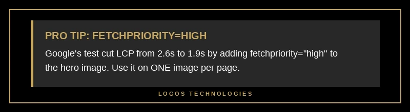
The single highest-impact thing you can do for LCP in 2026 is mark your above-the-fold image with fetchpriority="high". Google's own engineers documented tests where adding that one attribute improved LCP from 2.6 seconds to 1.9 seconds — a 27% improvement from a single character of HTML. Real-world performance audits typically see 20-30% LCP improvements from correctly setting fetch priority.
Why is it that impactful? By default, browsers don't know which image is the LCP image until they've parsed enough of the page to figure out layout. That's wasted time. The fetchpriority="high" hint tells the browser "start downloading this immediately, before scripts, before other images, before anything that isn't critical CSS." On a fast connection it might save 200ms. On a slow 4G connection it can save over a second.
The flip side: only use fetchpriority="high" on ONE image per page — your actual LCP element. Marking everything high is the same as marking nothing high. If you're not sure which image is the LCP element, run a Lighthouse audit and check the "Largest Contentful Paint element" section. For the deeper LCP playbook, our guide on how to improve LCP in 2026 walks through the specific patterns for each LCP type, and our broader website speed optimization guide covers the full Core Web Vitals stack.
Responsive images: srcset and sizes without breaking layout
A 1600px wide hero image looks great on a desktop monitor. On a 375px wide iPhone, it's a 17× overdownload — the browser shrinks it to fit, and you wasted 90%+ of the bytes you sent. Responsive images with srcset and sizes fix that.
The 2026 best practice for srcset: provide at least three width variants — 400w, 800w, and 1200w for content images, plus 1600w or 2000w for full-bleed hero images. The browser picks the smallest variant that's sharp at the current viewport's device pixel ratio. On a Retina iPhone at 375 CSS pixels, that means a 750px-wide actual image — exactly what your 800w variant covers.
The sizes attribute tells the browser "this image renders at X width given the current viewport." For a full-width hero, that's sizes="100vw". For a three-column grid on desktop that becomes one column on mobile, it's something like sizes="(min-width: 1024px) 33vw, 100vw". Get this wrong — say, leave sizes="100vw" on a 33vw column image — and the browser downloads three times the bytes you needed.
New in Chrome 126+ and Edge 126+: sizes="auto", but ONLY for lazy-loaded images. For lazy-loaded below-the-fold images, this lets the browser calculate the correct size from CSS layout at the moment of fetch, which is significantly more accurate than any sizes attribute you can write manually. Use it for below-the-fold content. Don't use it for the LCP image (which shouldn't be lazy-loaded anyway).
Why width and height attributes are non-negotiable
Every <img> tag needs explicit width and height attributes — even on responsive images, even when CSS will resize the displayed image. Browsers use the ratio (not the absolute values) to reserve layout space before the image bytes arrive, which prevents the layout shift when the image finally paints. Omit them, and every image on the page contributes to CLS. If you're trying to track down a flickering layout, this is usually where to start — and our guide on how to fix cumulative layout shift covers the full diagnostic playbook.
Lazy loading: where it helps and where it hurts
Native lazy loading — loading="lazy" on an <img> tag — defers downloading images that are below the fold until the user scrolls near them. No JavaScript library required. Per Chrome's image delivery insights, this can cut initial page load weight by 50%+ on image-heavy pages where most images sit below the fold.
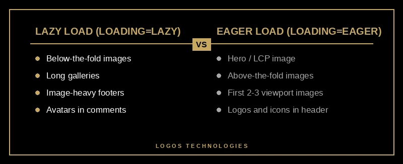
But there's exactly one rule that matters more than all the others: never lazy-load the LCP image. The whole point of LCP is "how fast does the largest visible thing paint?" — lazy-loading it adds a delay before the browser even starts downloading it. Use loading="eager" (the default) on your hero. Use loading="lazy" on everything below the fold. Don't get fancy.
A second nuance: don't lazy-load images that are likely to be in the viewport on smaller screens. A "below the fold on desktop" image might be "above the fold on mobile" because mobile viewports are taller relative to content. If you're not sure, set loading="eager" for the first two or three images and loading="lazy" for everything after.
Why image optimization matters more than ever in 2026
Three things changed in the last 18 months that make image optimization more important, not less.
First, the March 2026 Core Web Vitals update re-weighted LCP and CLS in Google's ranking signals, and image issues drive both. Sites that nailed LCP a year ago are losing ranking now because the bar moved.
Second, Google Images drives 22.6% of all web traffic — a share of organic discovery you only access if your images have descriptive filenames, proper alt text, and resolve quickly enough that Google's image crawler treats them as high-quality.
Third, AI Overviews and visual search via Google Lens (over 12 billion queries per month) cite optimized image content with structured data far more often than page-builder sites that wrap images in three layers of divs and lazy-load polyfills.
Image optimization has stopped being a "nice to have for performance nerds" and become a core ranking lever. If you're building a fast website that's designed for speed from day one, images are the first thing you get right.
Frequently Asked Questions
What is the best image format for website speed in 2026?
AVIF is the smallest, WebP is the most compatible, JPEG is the universal fallback. The best practice is to serve all three using a <picture> element with <source> tags for AVIF and WebP and an <img> fallback to JPEG. Browsers automatically pick the smallest format they support, which means newer browsers get AVIF and older browsers degrade gracefully.
How much faster does WebP make a website?
WebP files are typically 25-35% smaller than equivalent-quality JPEGs. On an image-heavy page where images make up 48% of the total weight, switching from JPEG to WebP can reduce total page weight by about 12-17%. Most users notice the speed improvement most on mobile and on networks slower than 4G.
Should I use fetchpriority high on every image?
No — only on the LCP image (typically the hero image or main above-the-fold visual). Marking every image as high priority defeats the purpose because the browser has nothing to deprioritize. Use fetchpriority="high" on exactly one image per page and leave the rest at the default auto setting.
Does lazy loading hurt SEO?
Native loading="lazy" does not hurt SEO when implemented correctly. Google supports and recommends it for below-the-fold images. The only mistake that hurts SEO is lazy-loading the LCP image, which directly increases LCP and is a Core Web Vitals failure. Always eager-load above-the-fold images and lazy-load everything else.
Why are my images causing CLS even though they're optimized?
The most common cause is missing width and height attributes on the <img> tag. Browsers use the ratio of width to height to reserve layout space before the image loads. Without those attributes, the browser doesn't know how tall to make the image's container, content below it jumps when the image finally loads, and CLS spikes.
Get image optimization built in, not bolted on
At LOGOS Technologies in Papillion, Nebraska, every site we build runs a build-time image pipeline that generates AVIF, WebP, and JPEG variants in three responsive widths automatically — with fetchpriority, explicit width/height, and correct loading attributes wired into the templates. No plugins, no on-the-fly CDN conversion — just hand-coded HTML that ships the smallest possible image to every browser. If your site is failing image-related Core Web Vitals, see our web design services or contact us for a free image-performance review. We'll show you exactly what's costing you LCP — and how to fix it without a full rebuild.