Product Page Design That Converts: What Actually Sells in 2026

Table of Contents
TL;DR — Quick Hits
- Average ecommerce product pages convert at 1.5-3%; top performers convert at 4-8% — a 2-3x gap that compounds across every product you sell.
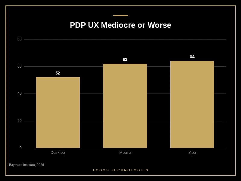
- Baymard's 2026 benchmark found 52% of desktop, 62% of mobile, and 64% of app product pages have "mediocre or worse" UX.
- The product image is almost always the LCP element — an unoptimized hero pushes LCP past 2.5 seconds, and bounce rate climbs ~32% for every second beyond that.
- Products with five or more reviews convert 270% better than products with zero reviews; for items priced over $100, the lift jumps to 380%.
- A high-converting product page is built — not bolted on with apps. The platform you choose decides how fast, how flexible, and how trustworthy the page can be.
If you sell anything online, the product page is where the money is made or lost. Search drives traffic to category pages and ads drive traffic to landing pages, but the click that turns a visitor into a customer happens on the product detail page (PDP). And according to Baymard Institute's 2026 Product Page UX benchmark, most of those pages are doing a mediocre job at best — Baymard's research scored 155+ leading ecommerce sites and found that 52% of desktop, 62% of mobile, and 64% of app product pages fall below acceptable UX standards.
That gap is the single biggest unforced error I see when small and mid-sized businesses ask me to look at why their store isn't selling. They obsess over ad creative and platform fees while their PDP is silently bleeding 50-70% of qualified buyers. This post breaks down what good product page design actually looks like in 2026, what the data says drives conversion, and where the technical foundation makes or breaks every other choice.
What is good product page design?
Good product page design is the layout, content, and performance combination that lets a qualified buyer make a confident purchase decision in under 30 seconds. It's not a checklist of trendy elements — it's a hierarchy: the highest-priority information (image, price, key benefit, CTA) renders first and renders fast, then everything that builds trust and removes objections renders below.
The reason every "anatomy of a high-converting product page" article keeps recycling the same elements (image carousel, reviews, sticky CTA, FAQ, related products) is that user research keeps finding the same buying decisions: Can I see it clearly? Has someone like me bought it? Is it actually in stock? Will it arrive when I need it? A product page exists to answer those questions in order, without making the buyer scroll, search, or wait.
Why most product pages fail in 2026
Most product pages fail for one of three reasons: they're slow, they're cluttered, or they're built on a platform that won't let the developer fix either problem.
Speed is the silent killer. On almost every ecommerce site, the largest above-the-fold element is the primary product image — meaning the product image is your Largest Contentful Paint score. Google's LCP guidance puts the "good" threshold at 2.5 seconds; for every additional second past that, bounce rates rise roughly 32%. The fix is technical, but the cause is almost always non-technical: a review widget, wishlist app, popup, chatbot, and recommender — each bolting in 50-200 KB of JavaScript that fires before the page can paint. The dynamics here mirror our deep dive on page speed and revenue, only worse — the buyer is one click from purchasing and one bounce from abandoning forever.
Clutter is the second killer. Most templates default to showing every possible piece of information — sizing chart, shipping policy, returns policy, fabric care, "as seen in" badges, related products, recently viewed, and the kitchen sink — all stacked vertically in a single scroll. When everything is emphasized, nothing is. The pages that convert give the visitor one obvious next action (Add to Cart) and progressively disclose the rest.
The third killer is the platform. This is the part most CRO articles skip, and it matters more than any of the front-end advice: the platform you build on decides what's even possible to optimize. App-heavy Shopify themes and bloated WooCommerce stacks frequently can't hit "good" on Core Web Vitals no matter how aggressively you tune them, because every plugin you've installed is a third-party script that you can't fully control. We laid out the full trade-offs in our best ecommerce platform 2026 comparison — the short version is that custom-built or static-first storefronts give you the headroom to actually fix what the data is telling you to fix.
What a high-converting product page actually does
A product page that converts at the 4-8% top-performer range — instead of the 1.5-3% industry average reported by VWO's 2026 ecommerce benchmark — does a small number of things very well. Here is what the research consistently identifies as the high-leverage elements.
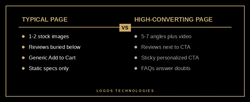
Image quality and quantity, optimized aggressively. 93% of consumers cite visual appearance as the deciding factor in their purchase. The pages that convert show the product from at least 5-7 angles, include a lifestyle shot showing scale, and (when the category supports it) include a 15-30 second video. Shoppers who watch a product video are 144% more likely to add to cart. Critically, the hero image is delivered as AVIF or WebP — AVIF is roughly 65% smaller than an equivalent-quality JPEG, and that delta is usually the difference between passing LCP and failing it.
Reviews, placed where the doubt lives. Products with five or more reviews convert 270% better than products with zero reviews; for items priced over $100, that gap widens to 380%. The placement matters as much as the count: putting the star average and review snippet adjacent to the Add to Cart button — not buried below the fold — is a documented conversion lift in nearly every CRO study. Reviews answer the buyer's "is this real?" question at the exact moment they're making the call.
A CTA that earns its real estate. Personalized, prominent CTAs have been measured to lift conversion by up to 202%. The mechanics are unglamorous: large enough to tap on mobile (44x44 pixels minimum), high contrast, single primary action ("Add to Cart"), no competing buttons within 100 pixels, and sticky on mobile so it follows the scroll.
Trust signals where the friction is. Free returns, secure checkout badges, ship-by date, and stock counts each remove a specific objection. Generic "trust badges" do almost nothing; specific, contextual signals — "Ships from Nebraska in 1 business day," "30-day no-questions-back returns," "12 left in stock" — do a lot.
Mobile-first, not mobile-tolerant. Mobile commerce is over 57% of all ecommerce sales. A product page that was designed on desktop and "made responsive" by squishing columns is a mobile-tolerant page. A page that was designed mobile-first — sticky CTA, swipeable image gallery, expandable accordions for long content, no hover-only interactions — is a mobile-first page. The difference shows up in the conversion rate.
Why your product page speed is your conversion ceiling
Every CRO tactic above has a ceiling, and that ceiling is page speed. Sites that pass all three Core Web Vitals thresholds see 24% lower bounce rates and 15-30% higher conversion rates compared to sites that fail. On a product page, the dominant CWV metrics are LCP (driven by your hero image) and CLS (driven by images that load without reserved dimensions and shift the layout).
The fixes that actually work are small and unglamorous. Set explicit width and height attributes on every product image so the browser reserves the space before the file arrives — this single change frequently moves CLS from "needs improvement" to "good" in one deploy. Serve responsive images via <picture> with AVIF first, WebP fallback, and JPEG as a final safety net. Preload the hero image with <link rel="preload" as="image" fetchpriority="high">. Defer or lazy-load anything below the fold. Audit every third-party script and ask whether the conversion lift it provides is bigger than the LCP cost it imposes — for most stores, half of the apps installed are net negative.
This is also where a static or static-first architecture pulls ahead. We've written before about how Core Web Vitals scoring tightened in Google's March 2026 update, and the punchline is that pages now need to be fast on the median visitor, not just the lab test. Static product pages — generated at build time and served from a CDN edge — start every visit with a head start that no amount of plugin tuning on a dynamic platform can fully match. That's a structural advantage, not a marginal optimization.

How does product page design affect SEO?
Strongly, and the connection has tightened in 2026. Product page SEO depends on three things: technical performance (Core Web Vitals are a confirmed ranking signal), content depth (Google's helpful-content scoring rewards pages that comprehensively answer buyer questions, not pages that just list specs), and structured data (Product, Offer, AggregateRating, and Review schema is what gets your stars and prices into the SERP and into AI Overviews).
The same design choices that lift conversion lift rankings — fast pages, descriptive copy, real reviews, and structured data tied to all of it. Skimping on PDP design and trying to win it back with off-page SEO is the most expensive way to grow a store, as our guide on how the best ecommerce platforms in 2026 stack up for SEO and speed lays out in detail.
Frequently Asked Questions
What is the average conversion rate for an ecommerce product page?
The average ecommerce product page converts at 1.5-3%. Top-performing stores hit 4-8%. The 2-3x gap is almost always explained by page speed, image quality, review density, and CTA design — not pricing or product. Closing the gap on a single high-traffic PDP often pays for the redesign within a quarter.
What is the most important element of a product page?
The product image, by a wide margin. 93% of consumers cite visual appearance as the deciding factor in their purchase. After the image, the next most-impactful elements are the price-and-CTA cluster, then customer reviews placed near the CTA. Everything else (description, specs, related products, FAQ) is supporting evidence.
How fast should a product page load?
Largest Contentful Paint should be under 2.5 seconds and Cumulative Layout Shift should be under 0.1. Bounce rate climbs roughly 32% for every second past the LCP threshold, and 53% of online shoppers expect a page to load in under 3 seconds. On a product page, the hero image is almost always the LCP element, so image format (AVIF or WebP), explicit dimensions, and a fetchpriority="high" preload are the highest-leverage fixes.
How many product images should a product page have?
Five to seven minimum, plus a video when the category supports it. The set should include: a clean front shot, multiple angles, a detail or texture shot, a scale-or-context lifestyle shot, and (for apparel, furniture, or anything fit-dependent) an in-use shot. Shoppers who watch a product video are 144% more likely to add to cart, so video is one of the highest-ROI additions you can make.
Do FAQs on product pages help with AI search?
Yes — and the effect compounded in 2026. AI shopping assistants like ChatGPT, Gemini, and Perplexity scan product page FAQs to decide which products to recommend, and Google's AI Overviews and People Also Ask boxes pull from the same structured Q&A content. Three to seven well-written FAQs per PDP, written as full questions with concise 40-60 word answers, is the current best practice for both human shoppers and AI extractors.
How LOGOS Technologies builds product pages that actually convert
I'm Jacob Anderson, owner of LOGOS Technologies in Papillion, Nebraska. I build hand-coded ecommerce sites for businesses that have outgrown what their app-heavy Shopify or WooCommerce store can deliver — sites where the product page is engineered to pass Core Web Vitals on the median visitor, not just the lab test. If your conversion rate is stuck at 1.5-3% and you suspect the page itself is the ceiling, that's a fixable problem. See our web design services for the full scope, or contact us for a free product page audit.